
A curated edit of design notes, inspiration, and the art of luxury wedding stationery.
Semi-Custom vs Bespoke Wedding Stationery
Unsure which is the right choice for you?
This guide explains the difference between both options and helps you choose the design experience that best suits your style and vision.
What’s the Difference?
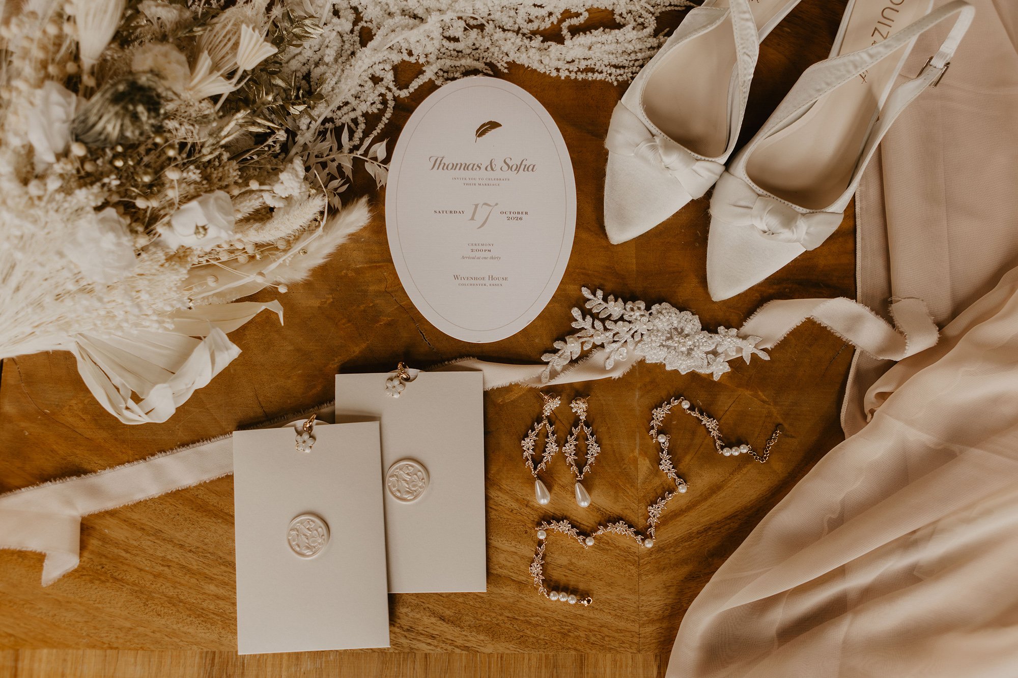
Choosing your wedding stationery is about so much more than selecting pretty paper. It’s the first chapter of your wedding story… the moment your guests glimpse the tone, style and feeling of what’s to come.
Your choices say a lot about who you are as a couple and the kind of atmosphere you want to create.
At Honey Bee Mine, I offer two distinct design routes:
Signature Collections (semi-custom) and Bespoke Design.
Both are rooted in the same philosophy: beautiful design, luxury materials and thoughtful craftsmanship. But they serve different couples and different creative visions.
If you’re unsure which path is right for you, this guide will help you understand the difference and decide which experience best suits your wedding.

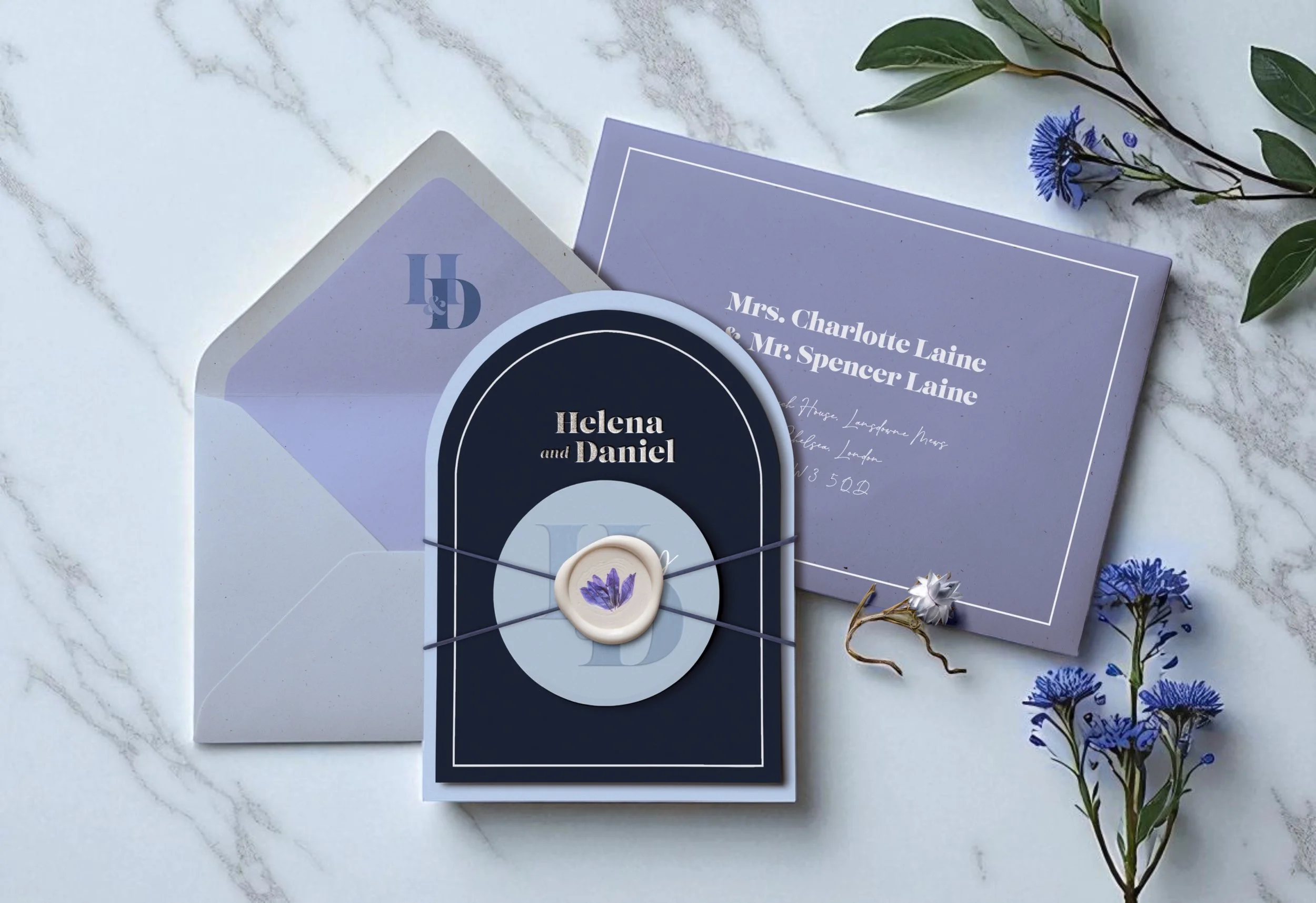
What is Semi-Custom Wedding Stationery?
My Signature Collections are carefully crafted design suites, created in advance and refined through months of creative development.
Each collection has its own identity, from typography and motifs to layout, finishes and overall mood. These designs are so much more than templates. They are fully considered compositions, art-directed and designed to feel editorial, timeless and cohesive.
“The beauty of semi-custom is that much of the creative groundwork has already been done. I’ve spent months developing each collection so that every element works harmoniously. This means you receive stationery that feels highly tailored, without starting from scratch.
And unlike many semi-custom offerings, every Honey Bee Mine suite is delivered fully assembled and presented exactly as it’s meant to be seen. It sits beautifully between traditional semi-custom and bespoke.
Think of it as tailored stationery, without the full bespoke price tag… offering the same quality, materials and craftsmanship you’d expect from a bespoke suite, in a more streamlined process.”
With a semi-custom design, your stationery can be personalised through:
Your wording and wedding details
A colour palette tailored to your wedding aesthetic
Varying levels of finish, including print techniques and embellishments
Matching on-the-day stationery pieces
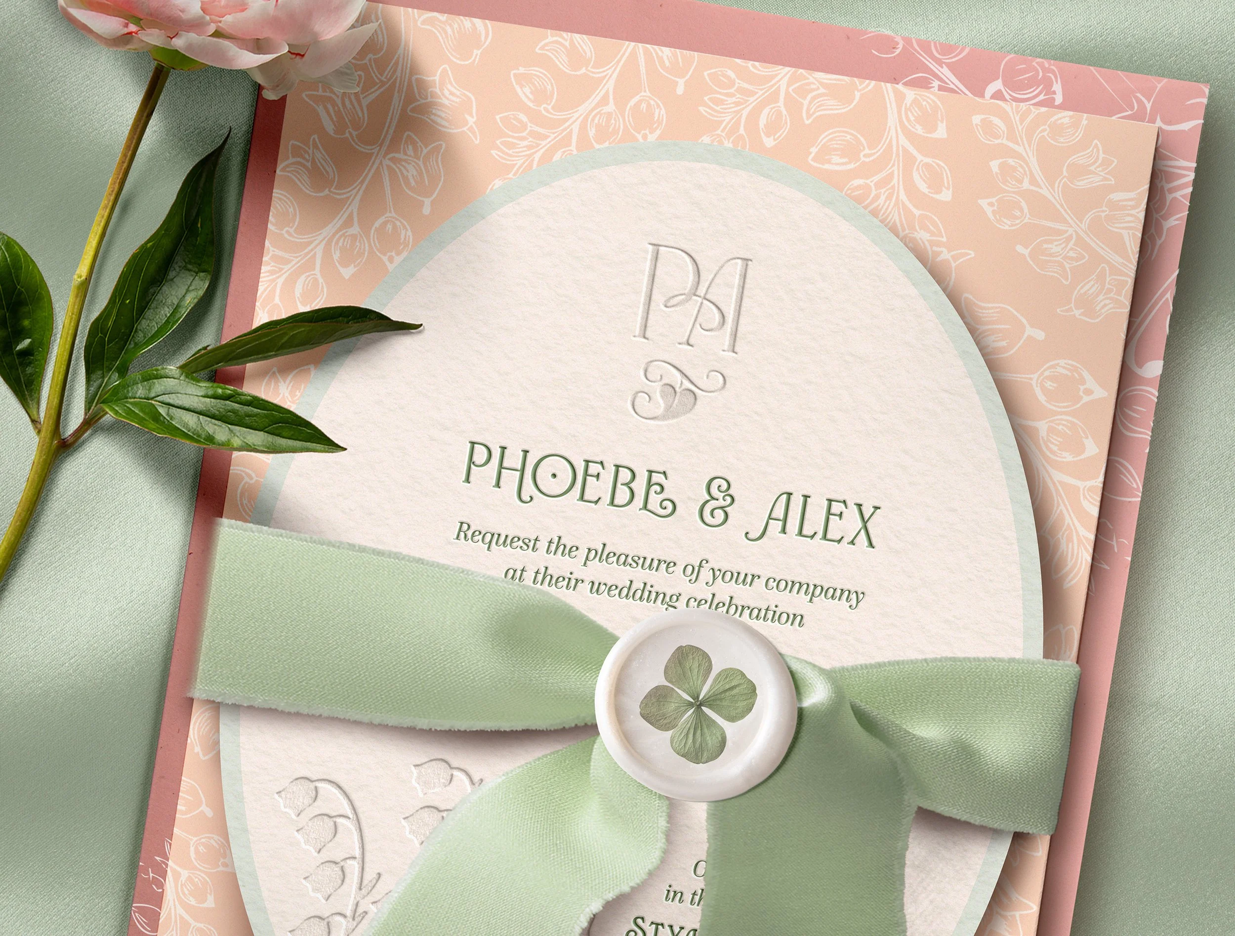
For example, a collection such as Sweet Like Honey could be created in champagne, ivory and gold rather than blush and rose-gold. Ever Entwined could be interpreted with soft florals in a pink and rose palette.
Small design refinements like these allow your stationery to feel unique to your wedding, while still retaining the integrity and beauty of the original collection.
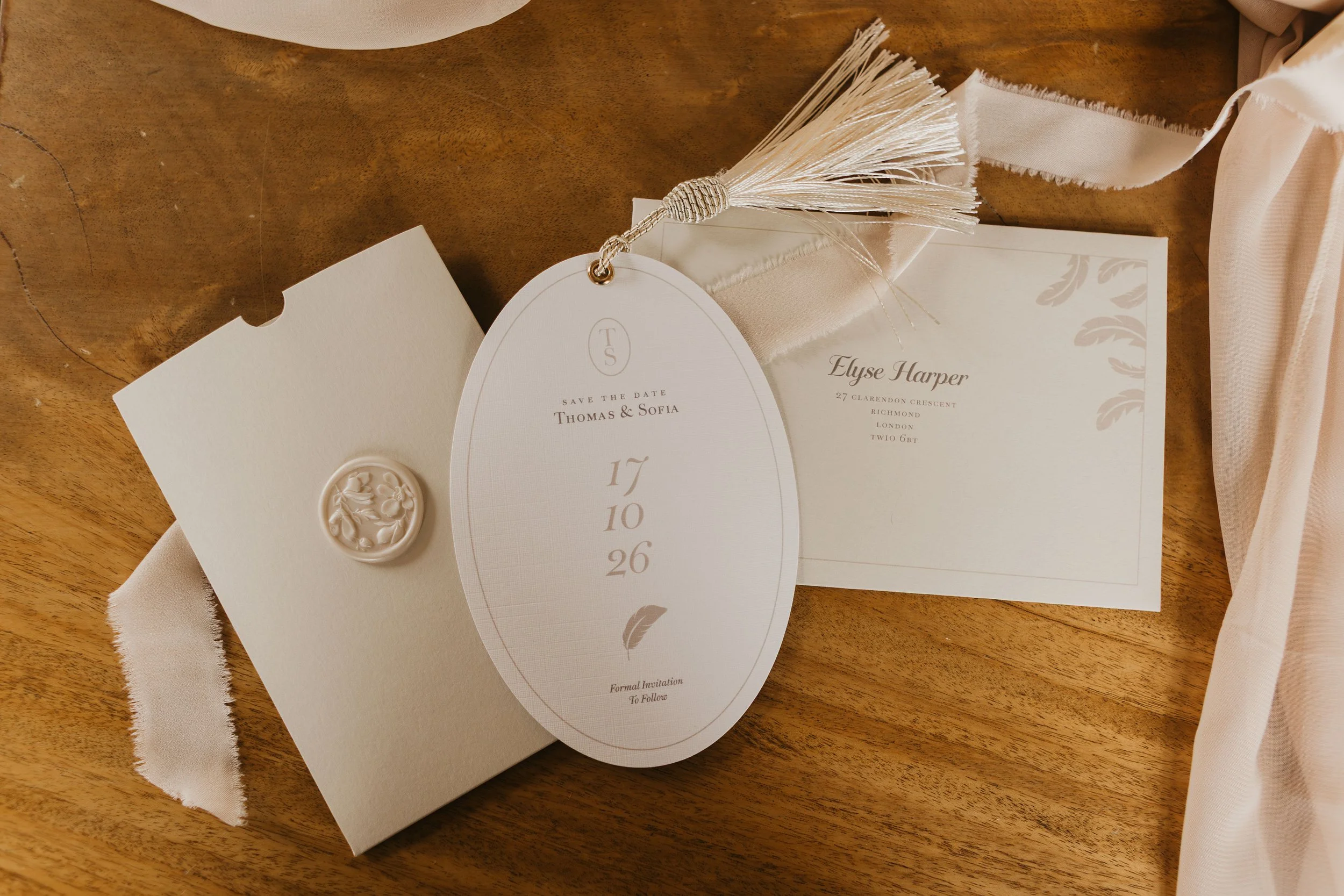
A Semi-Custom Example:
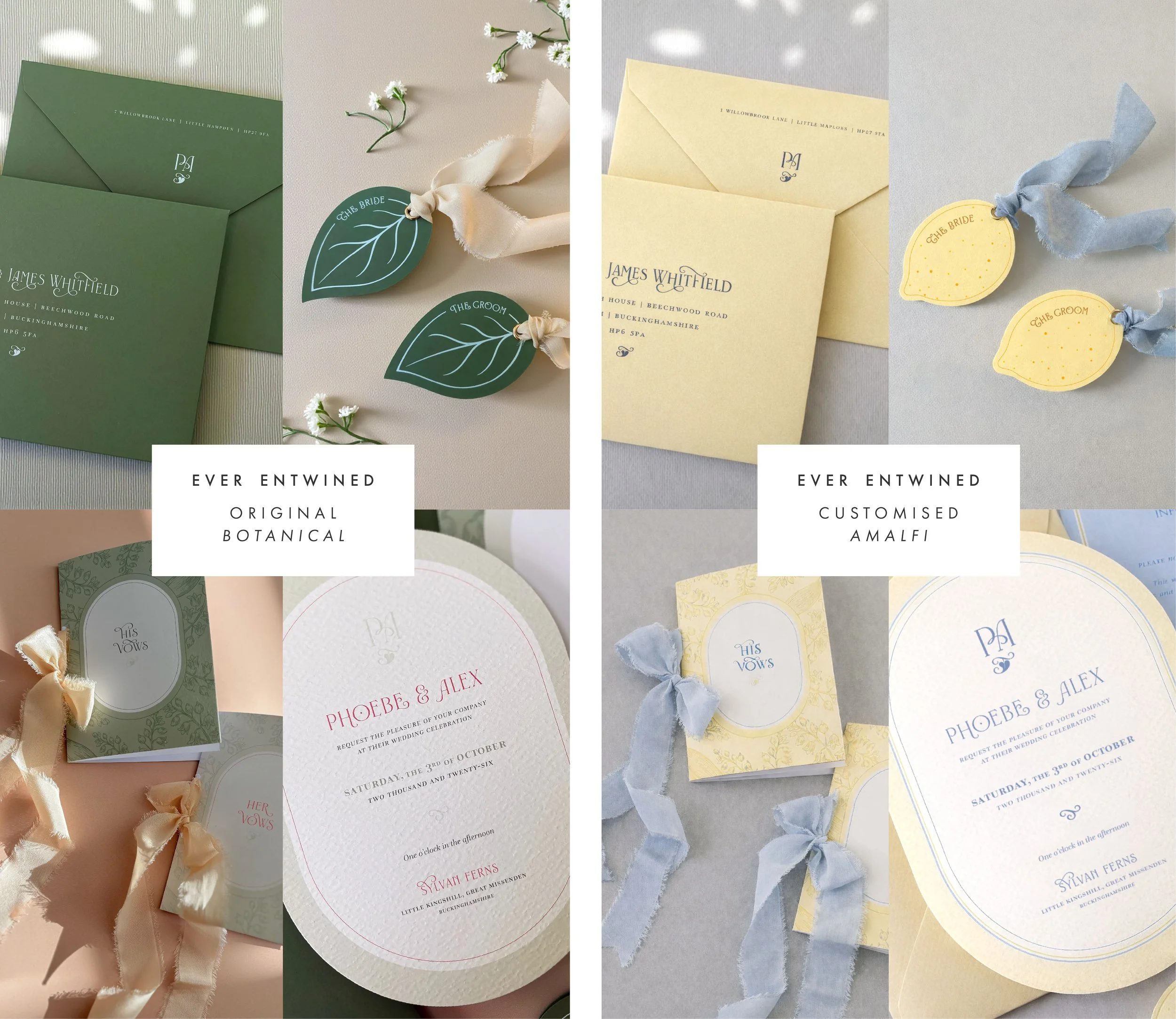
From Woodland to Amalfi
To help you visualise what semi-custom can look like, I’ve reimagined my Ever Entwined Signature Collection for a completely different aesthetic.
The original design is inspired by woodland botanicals. For this version, the same structure has been reinterpreted through a Mediterranean lens – with a lemon motif, a sunshine yellow and soft blue palette, and lighter, coastal textures.
The underlying design and structure remains exactly the same. What changes is the mood, colour story and motif.
This is one example of how a Signature Collection can be tailored to reflect your wedding style without starting from scratch. The same principle can be applied across all of my Signature Collections.
Semi-Custom is ideal if you:
Love one of my Signature Collections
Want stationery that feels personal but not created entirely from scratch
Appreciate a guided and refined design process
Want luxury design with clarity and structure
Value craftsmanship and detail without a fully bespoke investment
It’s very much like choosing a couture gown that is expertly tailored to you; the design exists, but the final result feels entirely yours.
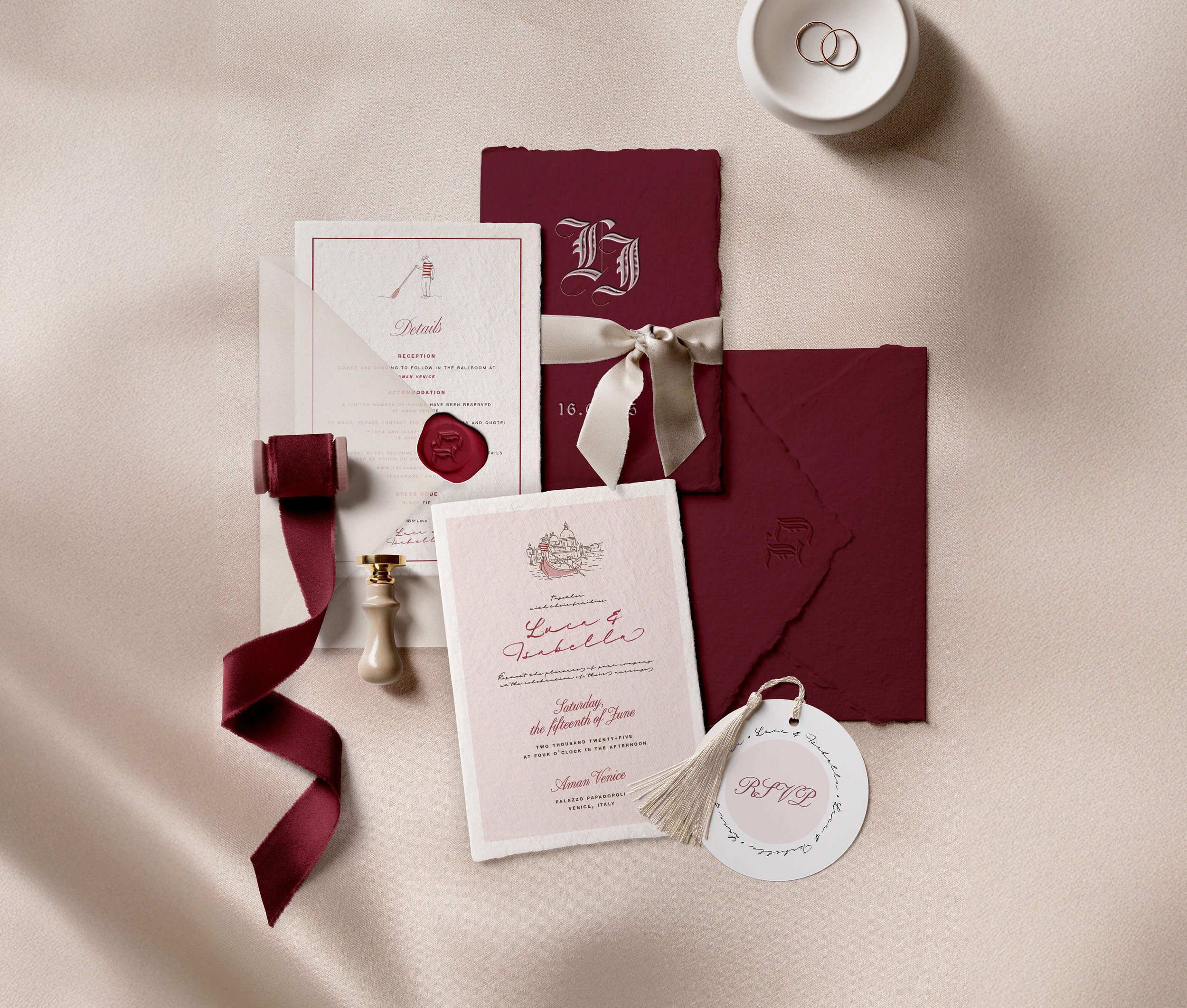
So, what is Bespoke Wedding Stationery?
Bespoke design is a completely different creative journey.
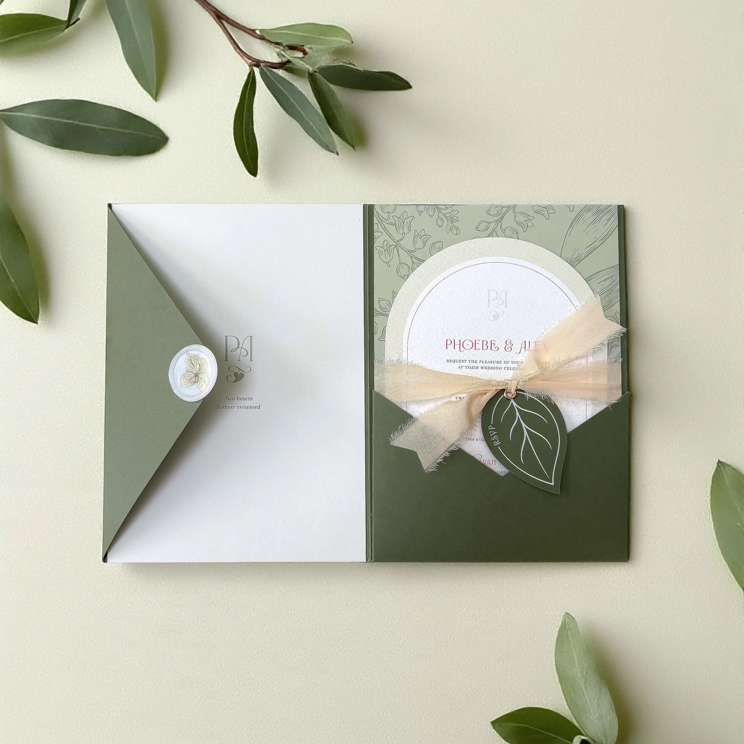
This is where your stationery is designed entirely from the ground up, inspired by your wedding, your venue, your story and your vision. Nothing is pre-designed. Every element is developed exclusively for you.
Bespoke design includes full creative direction, where I act as both designer and art director to shape the concept, colour palette, typography, motifs, materials and finishes from scratch.
With bespoke design, we can explore:
Custom monograms or motifs
A completely tailored colour palette
Special print techniques such as foiling, embossing or die-cuts
Bespoke formats and composition
Layered, editorial-style suites
One-of-a-kind on-the-day pieces
“The beauty of bespoke is that every design begins from scratch. Your stationery is created entirely around your wedding. We’ll begin by working together to define your concept, and then explore things like typographic style, paper choices, colour and finishing details.
It offers complete creative freedom, allowing your suite to reflect your story and your setting in a way that can’t be replicated. ”
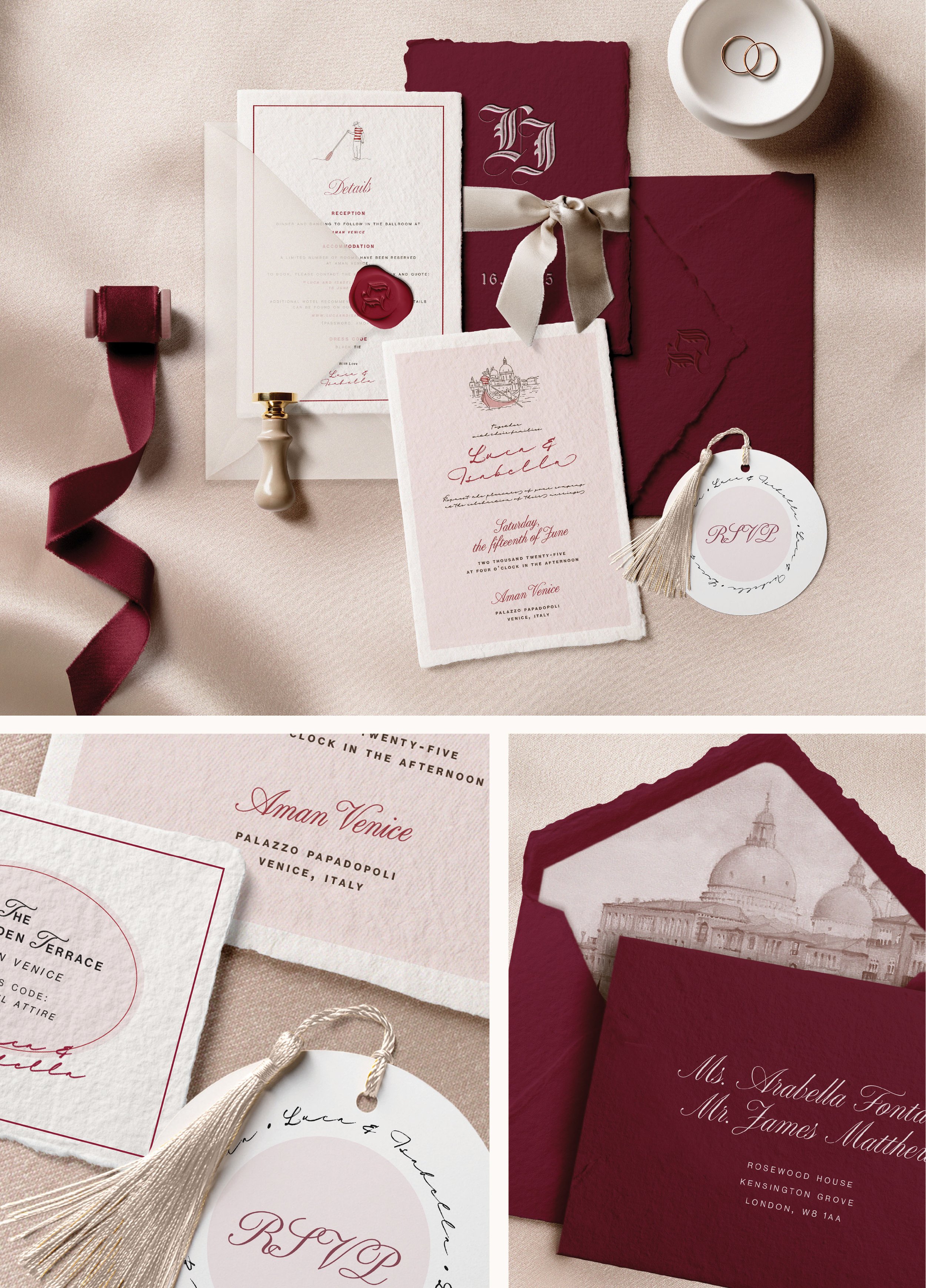
The below example shows a bespoke wedding stationery suite, designed from the ground up. Inspired by place, story and atmosphere, every detail has been created exclusively for one celebration, and for one couple only.
This is what it means to begin with a blank page…
Bespoke is ideal if you:
Want something no one else will ever have
Have a very specific creative vision or aesthetic
Want your stationery to feel like a true keepsake
Enjoy a collaborative, creative design process
Bespoke stationery is for couples who see design as part of the overall experience and find meaning in the small, personal details of their celebration.
Which should you choose?
You may be drawn to a Signature Collection if:
You’ve fallen in love with one of my existing designs
You want stationery that feels personal without starting from scratch
You value a refined and structured process
You want something elevated, but not fully bespoke
You’re working to a defined timeline
You may be drawn to bespoke design if:
You want your stationery to reflect a very specific vision
Your wedding is highly styled or design-led
You enjoy being involved creatively
You want something truly unrepeatable
Neither option is better, they simply suit different kinds of couples and different kinds of weddings.
My Approach
Whether you choose a Signature Collection or a bespoke design, every Honey Bee Mine suite is created with the same care and attention to detail.
I take on a limited number of clients each year to ensure every design receives the time and creativity it deserves. My background as an art director shapes how I approach each project, considering composition, balance, texture and story in every piece.
Stationery should never feel rushed or generic. It should feel like the beginning of something meaningful.
Still Not Sure?
If you’re unsure which route is right for you, that’s completely natural. Many couples begin the process without knowing exactly what they need, and part of my role is helping guide you there.
You can explore my Signature Collections or enquire about Bespoke design, and together we can decide which path is best for you.
One last Thought
Your stationery sets the tone for everything that follows.
Whether you choose semi-custom or bespoke, the aim is the same: to create something that feels thoughtful, beautiful and unmistakably yours.
Ready to explore your wedding stationery?
You can begin your journey by exploring the links below, then when you’re ready I’d love to hear about your plans and help guide you towards the perfect design for your wedding.
Frequently Asked Questions:
-
Semi-custom typically involves a lower investment because the core design has already been created, while bespoke is designed entirely from scratch. The main difference is usually the inclusion of an initial design fee for bespoke work, which covers the design and art direction of your suite.
-
Yes. Signature Collections can be personalised through wording, colour palette and selected refinements so your stationery feels personal to your wedding.
-
If you love one of the collections, but would like small changes such as an adapted colour palette – semi-custom may be perfect.
If you want something completely unique created only for you – bespoke design may be the right choice.
When to send your wedding invitations
Planning your wedding stationery?
Here’s exactly when to book, design and send everything for a seamless, stress-free 2026 celebration – from Save the Dates and Invitations to your On-the-Day stationery pieces.
My UK Guide for 2026 Couples
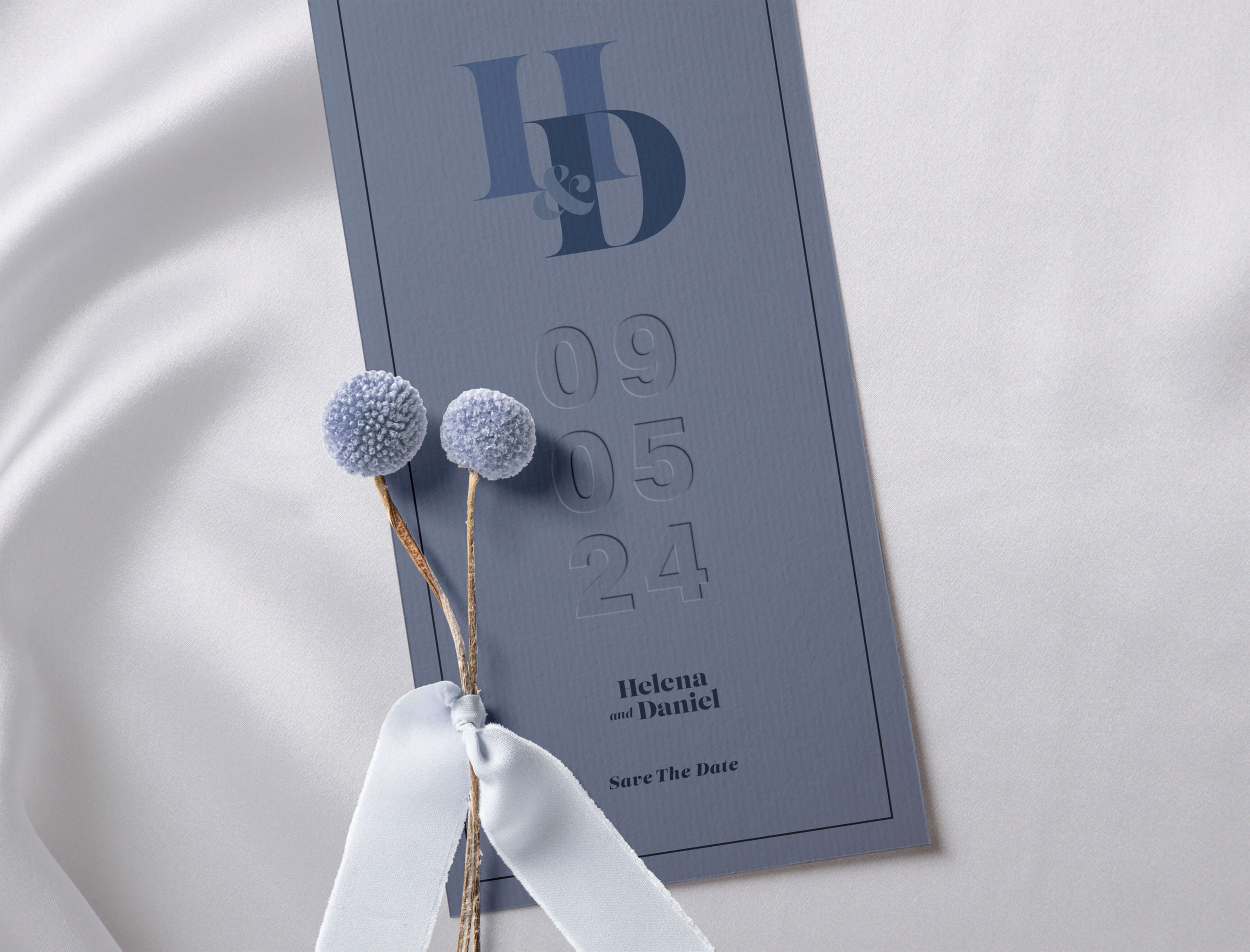
Save the Date from the La Plume Collection
Image by Capture It Photography
This is your complete timeline for Save the Dates, invitations, RSVPs, and on the day stationery.
Planning a wedding comes with a thousand moving pieces – and your stationery timeline is one of the most important. Beautifully designed invitations take time, especially when you’re choosing luxury finishes, bespoke artwork, or a cohesive wedding brand.
To make things easy, here’s a clear, UK-specific guide to when to book, when to design, and when to send each part of your stationery… tailored exactly to how I work at Honey Bee Mine.
Whether you’re planning a local celebration or a destination wedding, this timeline will help everything run smoothly (and stress-free).
White-Ink-Printed Envelopes from the Ever Entwined Collection
1. When to Get in Touch with Your Stationer
The earlier you reach out, the more availability and creative freedom you’ll have.
Bespoke Design
You can reserve your place 15–18 months before your wedding.
Bespoke design includes a fully custom concept, design mock-ups, pattern work, and luxury details. We won’t necessarily begin designing this early, but booking early secures your space in my diary and allows time to explore ideas thoughtfully. Plus, luxury takes longer than you think.
Semi-Custom Stationery
Book 9–12 months ahead to secure your timeline.
(Or sooner if you’re sending Save the Dates.)
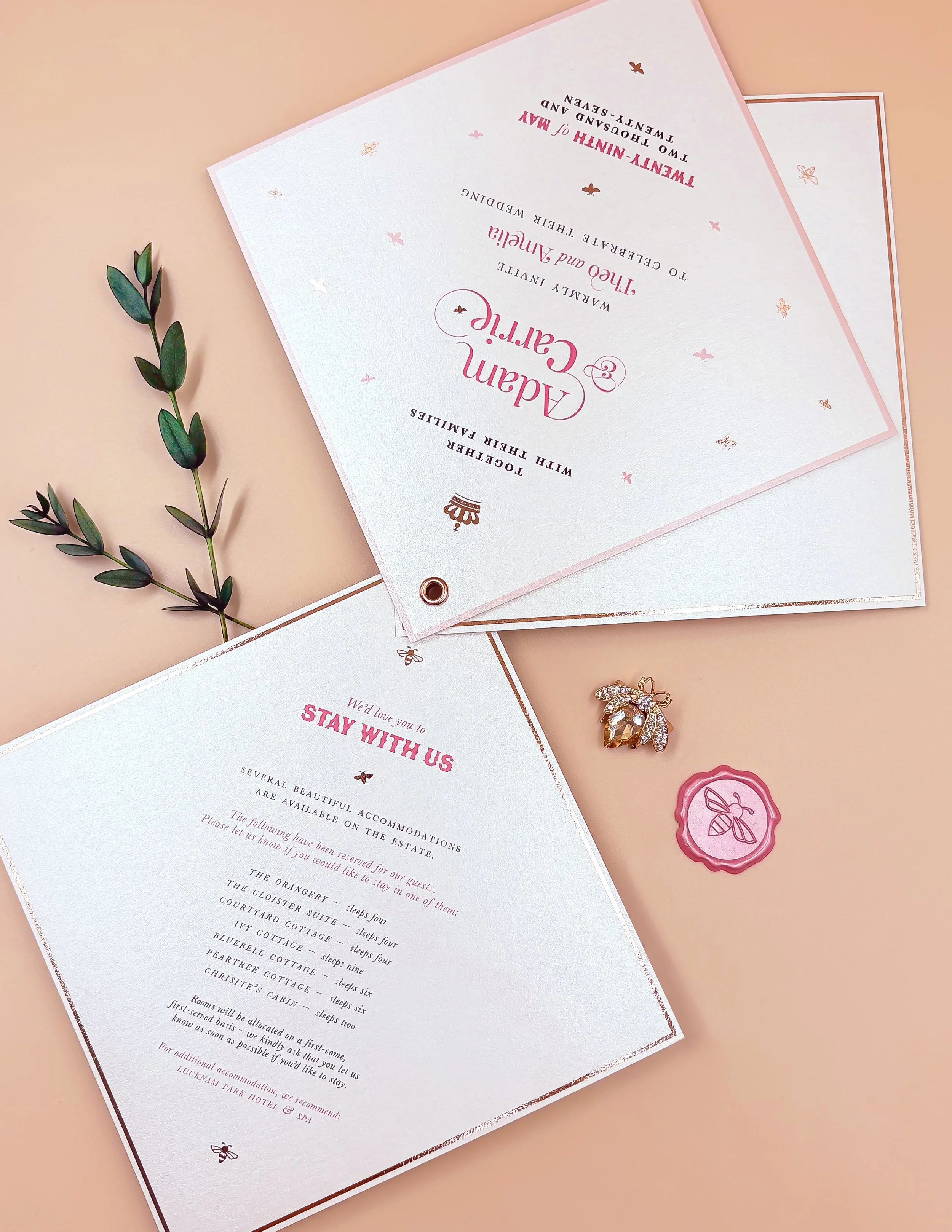
My semi-custom collections include Sweet Like Honey, Ever Entwined, and La Plume – each one customisable with colours, wording, print finishes, and monograms.
On-the-Day Stationery
Ideally, book at the same time as your invitations.
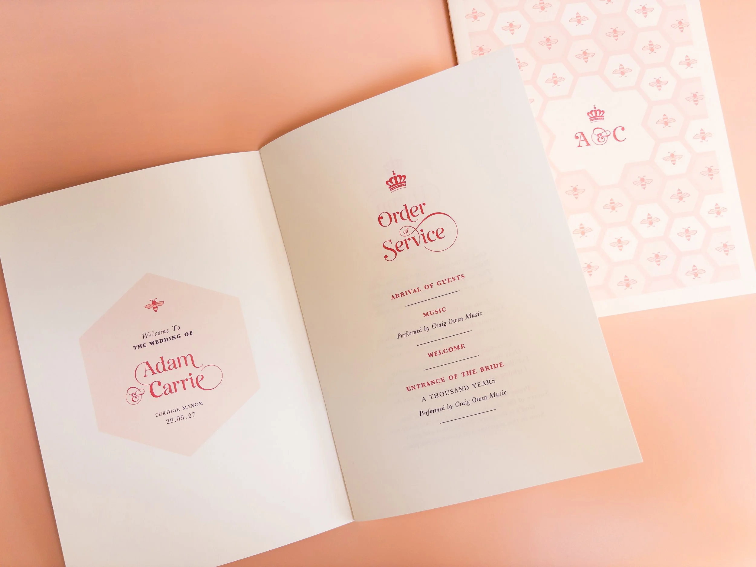
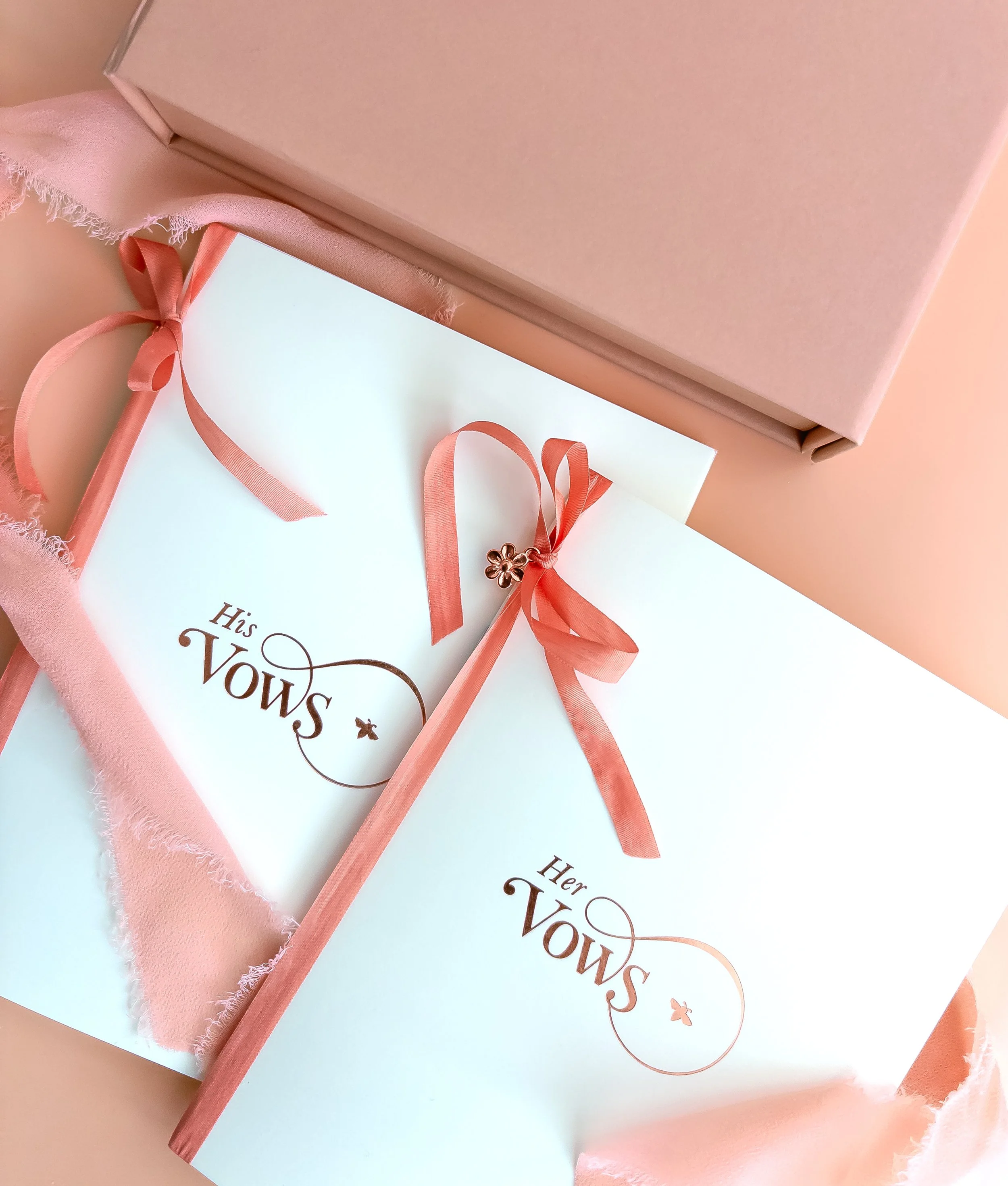
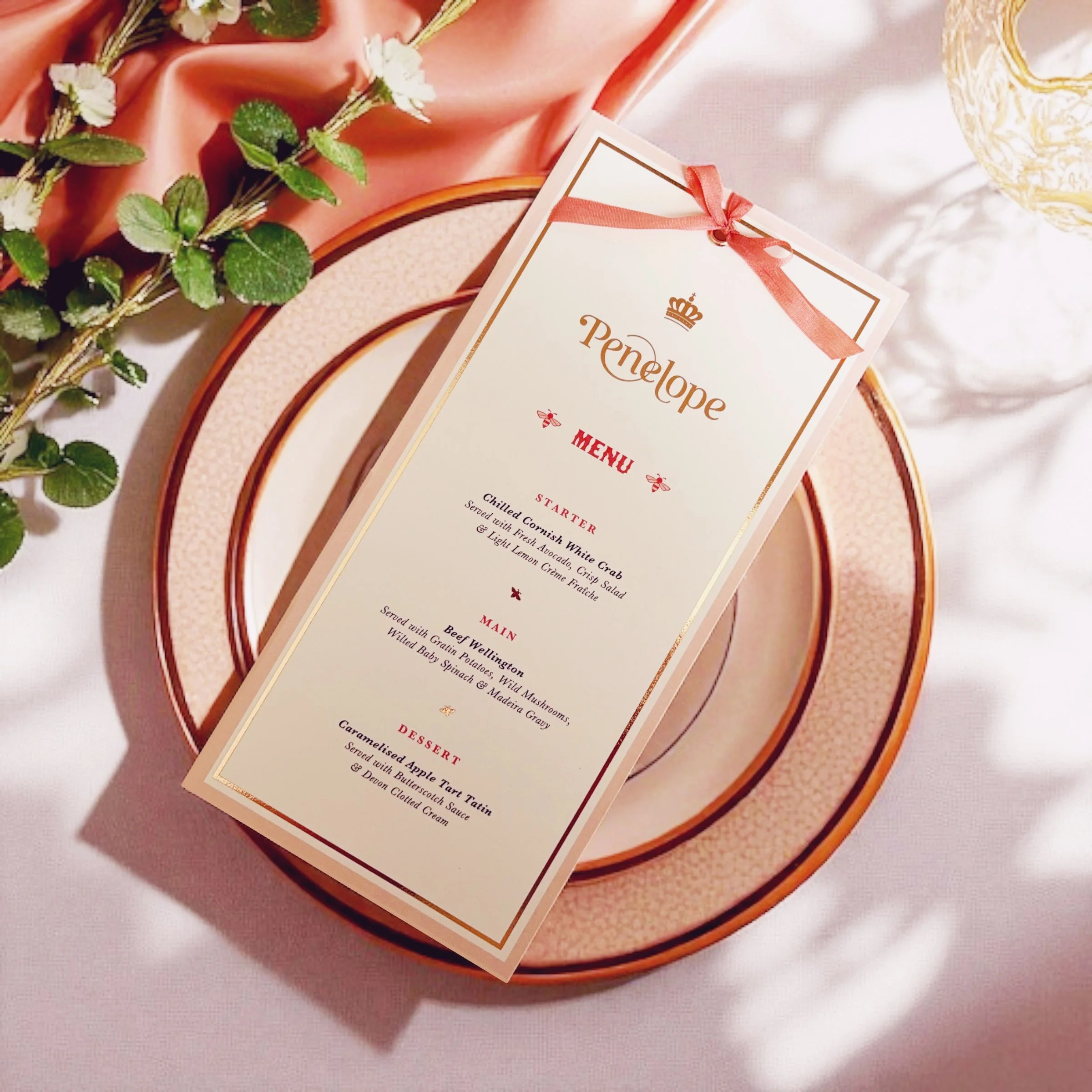
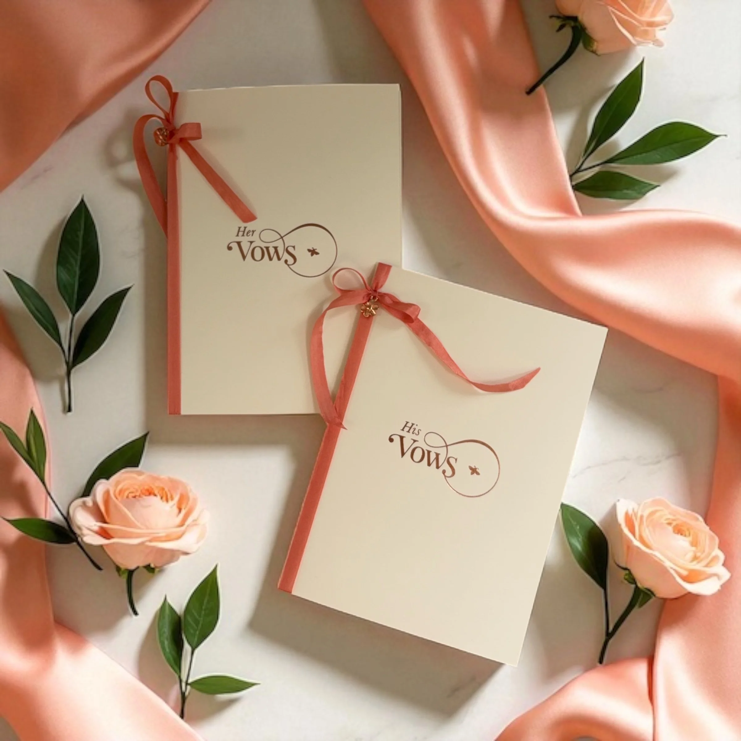
This ensures availability for menus, order of service booklets, signage, table plans, place cards, vow books, and more. These are the items that really create impact on your wedding day, and allow your style and personality to fully shine through.
Save the Date from the Ever Entwined Collection
Image by Gabby Culverwell Photography
2. Design & Production Timings
Every piece is handcrafted, printed on luxury stocks, and finished with details like foiling, embossing, tassels, linen papers and silk ribbons. Here’s how long the process typically takes:
Bespoke Timings
Around 12 weeks for the design process
+ 4 weeks for production and finishing
Total: 16 weeks
Semi-Custom Timings
Around 3 weeks for proofs
+ 4 weeks for production
Total: 7 weeks
On-the-Day Items
2–3 weeks for proofs (longer for bespoke options)
+ 3–4 weeks for production
Total: 5–7 weeks
(These timings ensure a luxury pace, with intention and attention to detail – never rushed.)
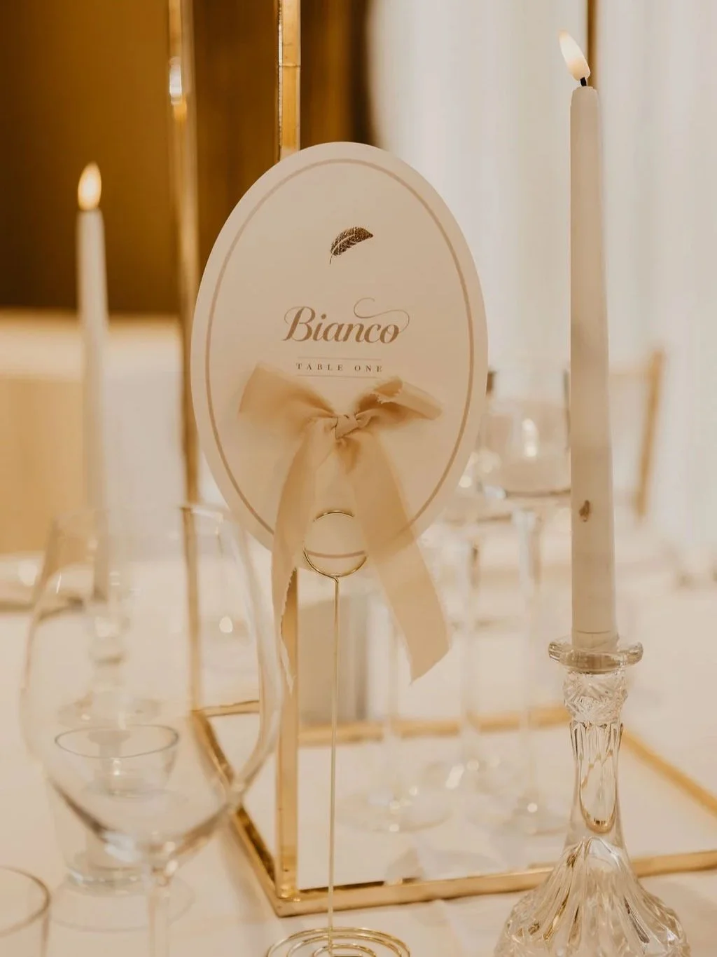
Table Names from the La Plume Collection
Image by Capture It Photography
3. When to Send & Finalise Your Stationery
Here’s the part most couples Google – so let’s break it down clearly.
Save the Dates
Send ideally 12 months before your wedding.
Particularly important for summer weddings, school holidays, and celebrations requiring travel.
Wedding Invitations
Send around 6 months before your date.
This gives guests plenty of time to RSVP, arrange accommodation, and make travel plans.
On-the-Day Items
Aim to have everything finished and in your hands around 2 weeks before your wedding.
➡️ This means you’ll need to confirm your final details at least 7–8 weeks before your date.
(Guest names, table arrangements, order of service content, menu choices, timings…)
Thank You Cards
Send 1–2 months after the wedding – or sooner if you prefer.
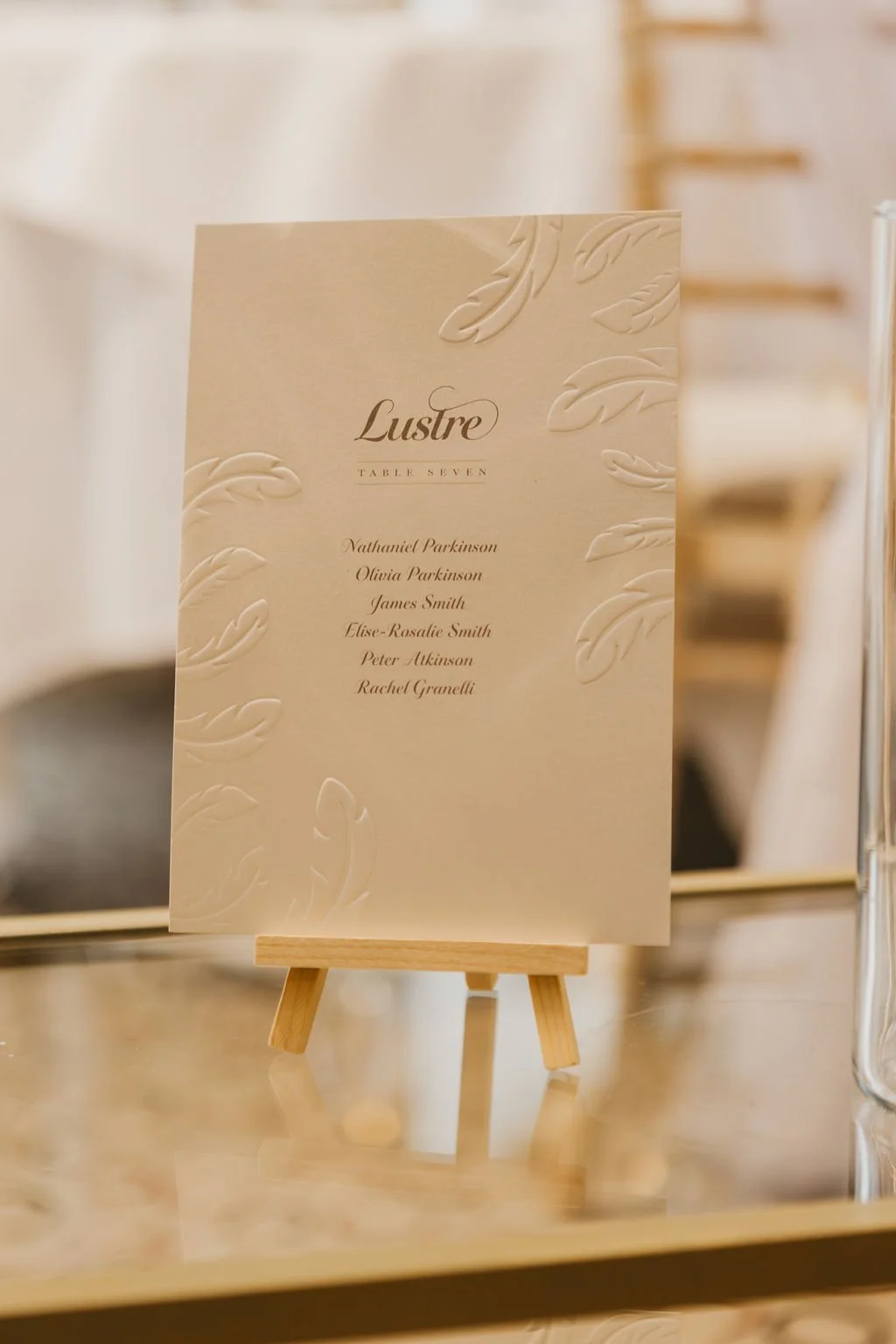
Table Plan Card from the La Plume Collection
Image by Capture It Photography
4. RSVP Deadlines (UK & Destination Weddings)
Your RSVP date should be earlier than you might expect, to give time for final numbers, seating, and the production of menus, table plans, and signage.
UK Weddings
Set your RSVP deadline 8–10 weeks before your date.
Destination Weddings
Set your RSVP deadline 10–12 weeks before your date.
This gives you the breathing room to finalise everything without last-minute stress, and enough time for your wedding stationer to complete your on the day pieces.

Invitations and Vows from the La Plume Collection
Image by Capture It Photography
Your Complete Wedding Stationery Timeline (At a Glance)
Ideal Timings:
12 months+ – Send Save the Dates
9–12 months before – Book your semi-custom stationery (sooner if you want Save the Dates!)
15–18 months before – Reserve bespoke design
6 months before – Send invitations
7–8 weeks before – Final details confirmed
2 weeks before – Receive on-the-day stationery
1–2 months after – Send thank you cards
Luxury Wedding Invitation from the Ever Entwined Collection
Planning Ahead Makes All the Difference
Luxury stationery isn’t just paper – it’s the beginning of your wedding story.
The first impression.
The tone-setter.
The moment your guests feel the magic.
Booking early ensures I can design something truly meaningful and beautifully personal to you.
If you’d like to check availability or begin your design journey, please say hello here:

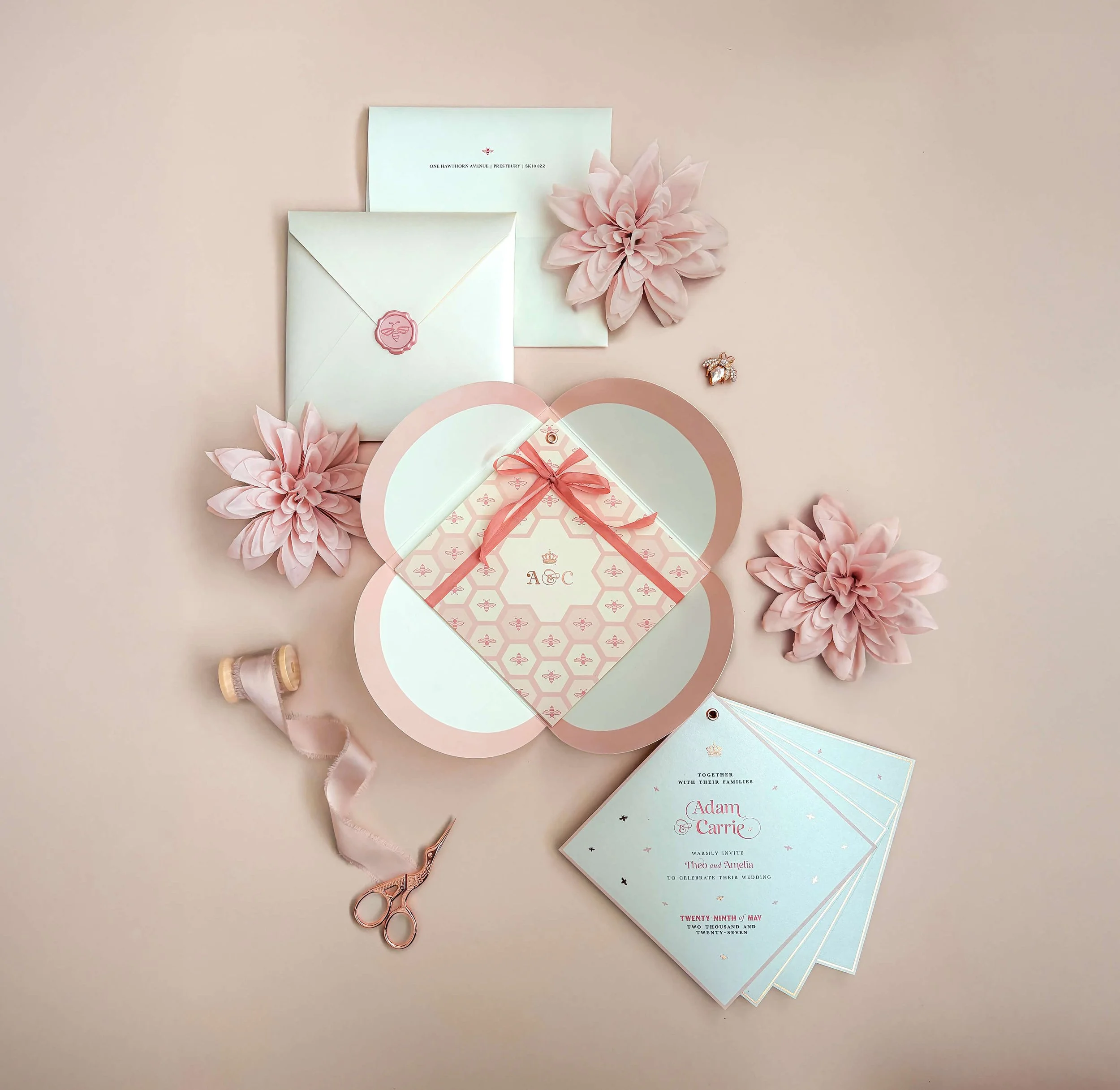
Designing A Wedding Brand: Sweet Like Honey
What if your wedding stationery didn’t just inform, but fully immersed your guests in a world designed around your love story?
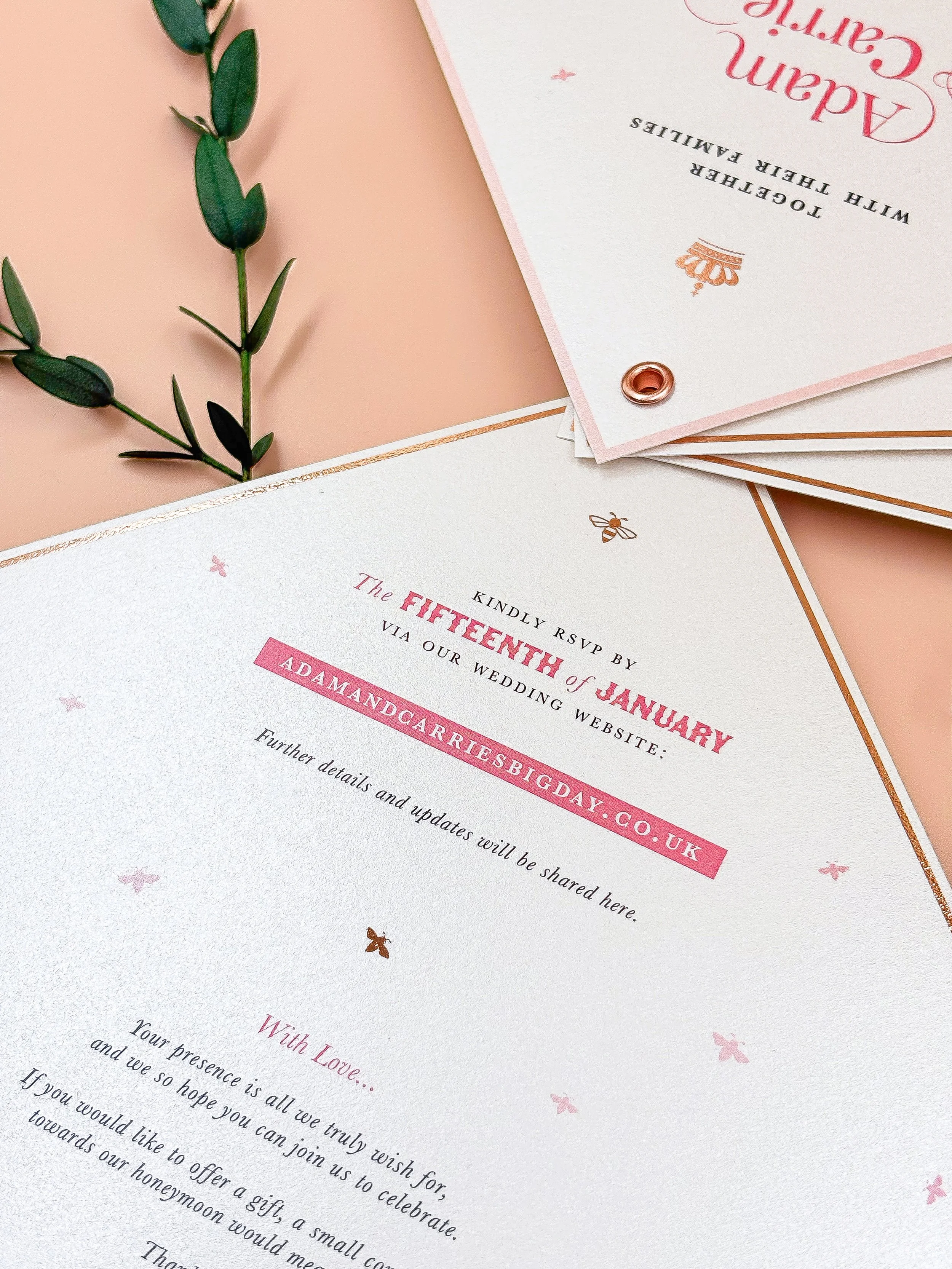
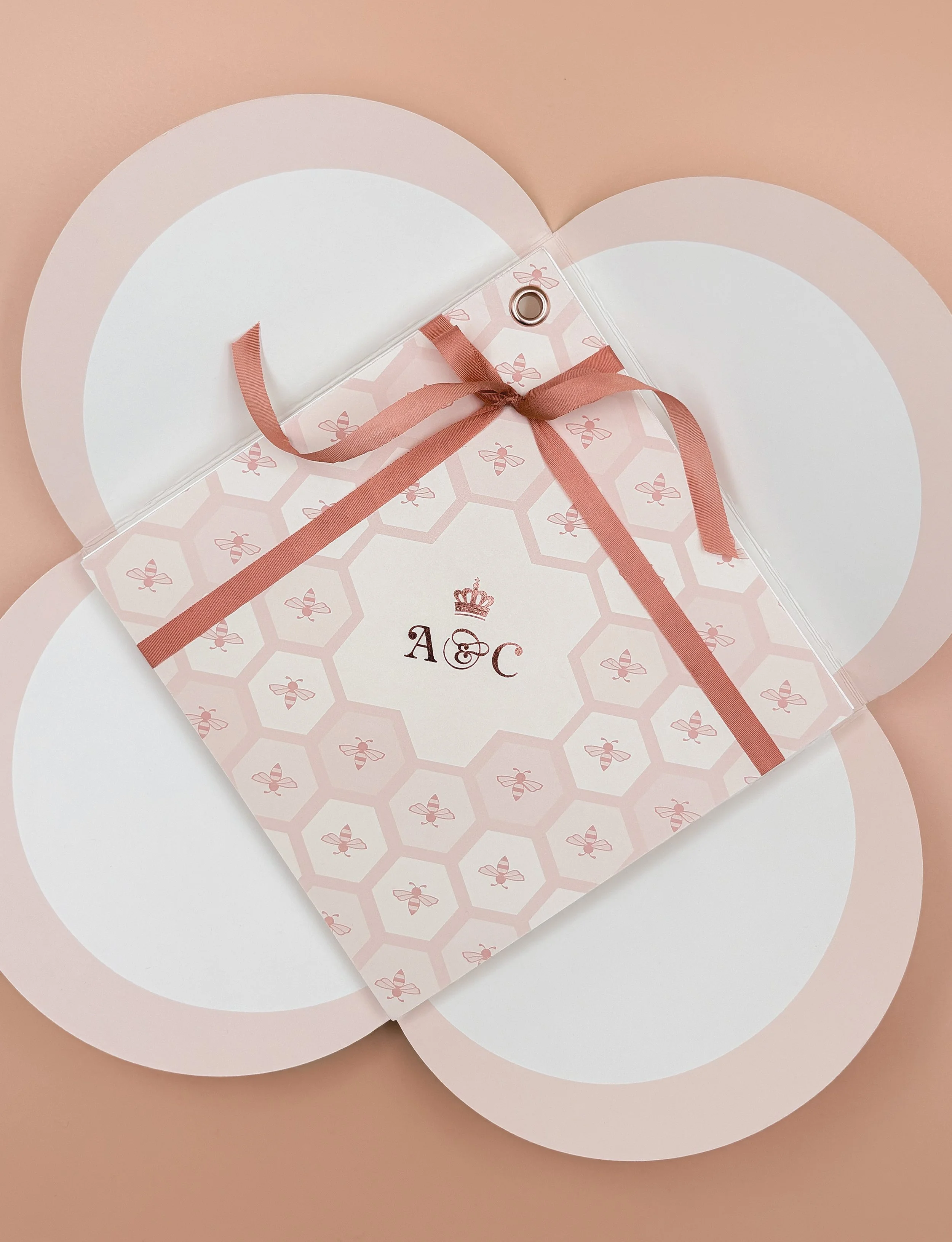
In this post, I’m exploring the idea of a wedding brand: the visual and emotional thread that connects every paper detail, from invitation to menu. Discover how my Sweet Like Honey suite brings that idea to life, with its soft blush palette, bespoke monogram, couture touches and signature honeycomb motif.


What if your stationery didn’t just notify your guests, but invited them into a whole world?
That’s the power of a wedding brand. It’s not about loud logos or gimmicky coordination. It’s about setting a tone that quietly lingers through every detail. A palette. A motif. A typeface. A feeling. And when it’s done right, everything belongs.
Let me show you exactly how that can look, through one of my distinct collections: Sweet Like Honey.


the vision
Created for couples drawn to elegant storytelling and soft editorial flair, Sweet Like Honey is a celebration of charm, craftsmanship, and quiet luxury. The suite was designed with Euridge Manor in mind – a Cotswolds dreamscape where ivy-covered walls, weathered stone, and golden light create a warm, organic backdrop. But it could just as easily belong to a Provençal estate or an Italian olive grove.
The brand feeling is timeless: natural beauty with a tailored edge. The styling is heavily inspired by couture fashion houses, with a palette of ivory, rose-gold and soft blush, combining elegant typography alongside a signature honeycomb print.

how the wedding brand comes to life
The Hallmark Elements:
✧ A Cohesive Palette
A warm blend of blush, soft honey, and creamy neutrals. Chosen not to shout, but to glow. The palette works across every item, from invitations to table menus, creating gentle consistency without ever feeling matchy.
✧ signature motif
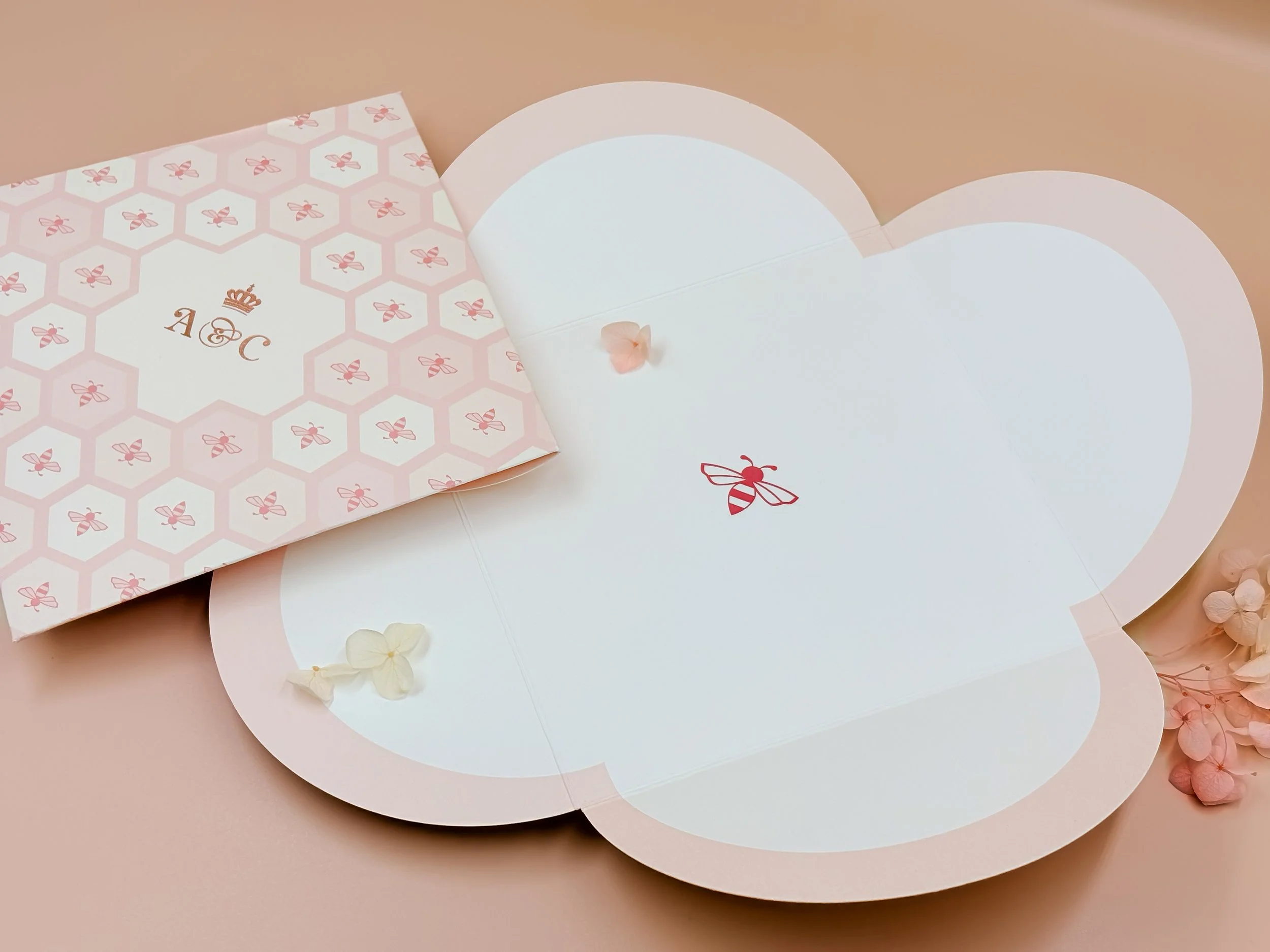
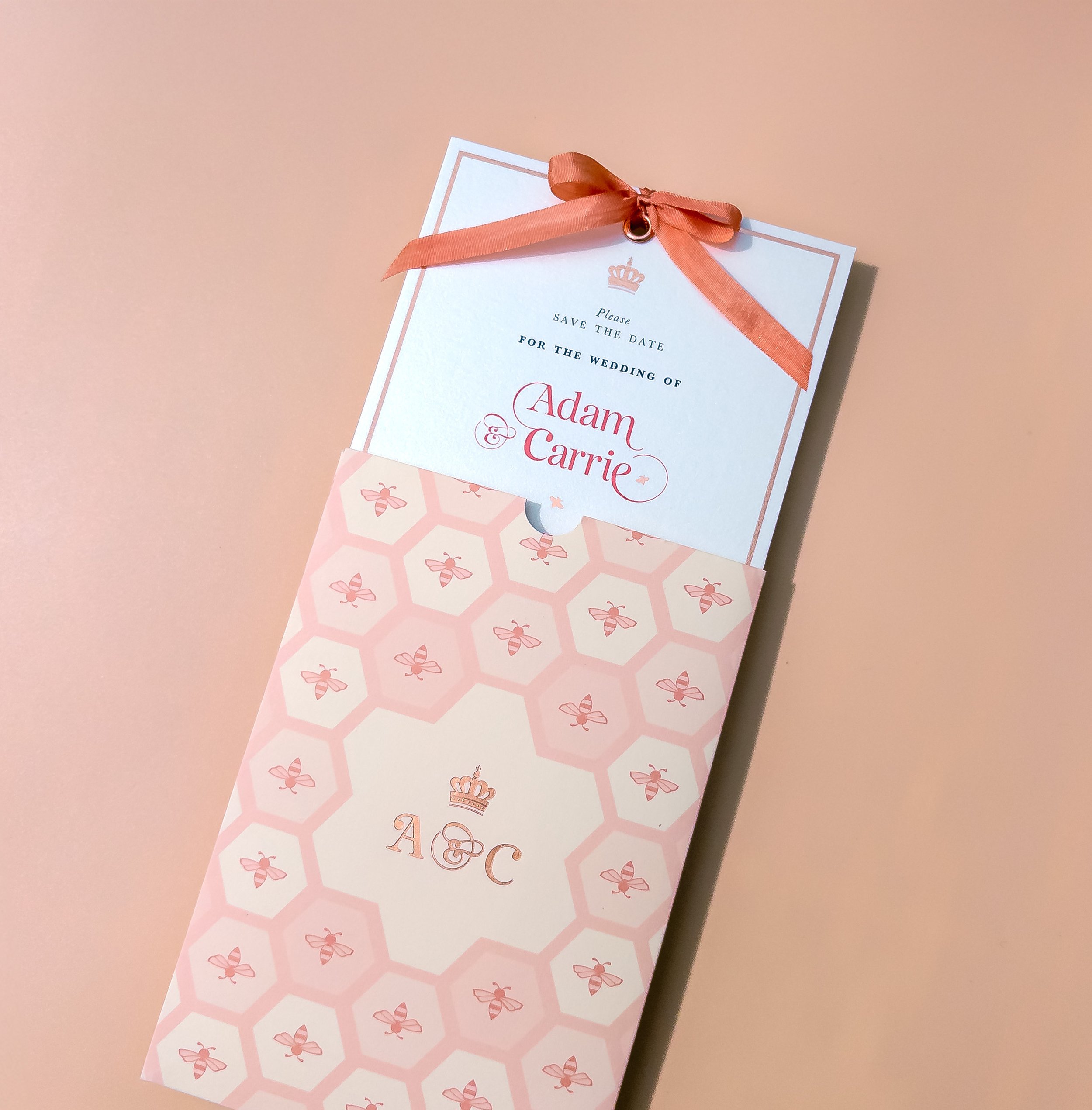
The honeycomb pattern is subtle yet distinctive. Each hexagon features alternating mini bees with the couple’s monogram at its centre. It acts as a visual signature – used sparingly but with purpose, appearing on liners, wallets, and signage to create recognition and rhythm.
✧ elegant typography
A refined serif paired with gentle italic script. The balance of structure and softness makes it feel effortlessly stylish. Just enough romance, never overly ornate.
✧ considered materials
Luxury card stocks create contrast and layering, with soft matte and pearlescent finishes. Delicate rose-gold foil accents catch the light without overwhelming. Every material choice is intentional. Tactile, thoughtful, true to the brand.


beyond the invitation
The Sweet Like Honey wedding brand doesn’t stop at the invitation. It lingers through every detail:
Arch-cut welcome signage echoes the suite’s elegant design and layout, framed with the signature honeycomb motif and classic typographic styling for a soft yet striking impression.
Personalised menus continue the story with tall, slim proportions and matching rose-gold foil. Hand-styled with coordinating ribbon to sit beautifully on your tablescape.
Custom envelope liners are printed with either the couple’s monogram or the honeycomb pattern, revealing a glimpse of the suite’s identity from the very first moment.
Delicate wax seals and silk ribbon ties act as tiny couture touches, creating thoughtful, decorative signatures that complete the experience.
Each element feels purposeful and connected. A thread of beauty woven quietly through the day.


why it works
Sweet Like Honey isn’t just a stationery suite. It’s a full visual identity. A wedding brand in the truest sense. And the best part? It doesn’t overwhelm. It supports your day, gently elevating it with intention and elegance.
Whether you choose this collection for your wedding, or use it as a starting point to inspire something entirely bespoke, it shows what’s possible when every detail is designed to belong.

want to see the finer details?
Order your Sample Edit to experience Sweet Like Honey up close.
Beautifully packaged and ready to inspire your own signature look.

The Rise of The Wedding Brand
The new standard in modern weddings?
A signature style.
Today’s couples are crafting wedding experiences as thoughtful as their favourite fashion labels. This piece explores how stationery has evolved into something more than paper – a visual identity with meaning, cohesion, and unmistakable charm. Welcome to the era of the wedding brand.

In the world of modern weddings, the age of one-size-fits-all is over.
Today’s couples are curating experiences that feel as considered and cohesive as their favourite fashion labels or boutique interiors. From the moment a Save the Date lands on a doormat to the final toast on the big day, every detail has meaning. A palette that speaks without words. A typeface that feels like you. A monogram that says we’re here, and this is our story.
This is more than stationery. This is your wedding brand.
So, what is a wedding brand?
Let’s be clear: this isn’t about logos or slogans.
A wedding brand is the subtle visual thread that connects every part of your celebration. It’s your personal style, distilled into something timeless and tactile. A signature that whispers throughout every element, from invitations to table names to vow books.
It might include:
A colour palette inspired by something personal, like your venue or home
Custom typography that sets the tone (elegant, romantic, modern)
A bespoke monogram or motif that repeats subtly across your suite – like your own personal signature, softly tying everything together
Consistent textures, print finishes and paper stock that speak to your story
A tone of voice that feels just right. Soft, playful, poetic, or bold
Done well, it’s cohesive without being matchy.
Meaningful, not over designed.
And always personal.

It all begins with stationery
That first piece of wedding stationery isn’t just a date in a diary. It’s your opening chapter. When your guests tear open the envelope, they’re stepping into the world you’re creating.
Think of the way some iconic weddings (from Vogue spreads to celebrity ceremonies) use one consistent palette, font, and motif throughout every touchpoint. It’s never loud. But it lingers.
And of course, the details aren’t chosen at random. They reflect a lifestyle, an aesthetic, a story. This is exactly what a wedding brand does: it becomes a subtle mirror of who you are, together.
Designing your signature style
Here’s the beauty of building a wedding brand…
It doesn’t have to be complicated. It just needs to be you.
Here’s where to begin:
✧ Choose your palette wisely
Pick colours that reflect your surroundings, the season, or the mood you’re trying to set. Perhaps they mirror the sandstone of your venue, the linen in your wardrobe, or the deep blue of the night sky you got engaged beneath.
✧ Create or customise a monogram
A bespoke motif, initials intertwined, a delicate emblem, a hand-drawn bee or constellation, adds a sense of identity and longevity. Something you can carry across your stationery, signage, wax seals… every aspect of your visual storytelling.
✧ Be consistent, but not rigid
Let fonts, textures and layouts evolve naturally across different stationery items, but stay within the same design family. This creates flow without feeling forced.
✧ Honour tactility
A wedding brand isn’t just visual, it’s felt. Think foil details that catch the light, blind embossing that invites touch, or translucent vellum that adds softness and depth.
You don’t need to shout your style. A whisper, repeated with care, is infinitely more powerful.


The Honey Bee Mine approach
At Honey Bee Mine, every collection is built around its own quiet identity, from the romantic script and soft blush palette of Sweet Like Honey, to the refined, botanical notes of Ever Entwined. Each one has a signature, a soul, and a sense of who it belongs to.
And for couples wanting something entirely bespoke? I offer the chance to build your wedding brand from the ground up. Starting with a concept, a feeling, a vision – we’ll bring it to life together, piece by piece.
A final word
You don’t need a logo to have a wedding brand.
What you need is purpose. Beauty that repeats in subtle ways. Consistency that feels effortless. And design that reflects who you are – not just as individuals, but as a couple, starting forever.
Let’s build something you’ll want to look back on years from now. Stationery that lasts.

Ready to begin?
Order a Honey Bee Mine Sample Edit today and start shaping your signature style.
Want to see a wedding brand in action?
Step inside the world of Sweet Like Honey →
A stationery suite inspired by golden light, soft blush, and couture-level detail.
A perfect example of how a signature look can linger long after the day itself.

Wedding Stationery Trends for 2026
Discover the most beautiful wedding stationery trends for 2026.
From fashion-inspired layouts to timeless palettes and tactile finishes. A curated, luxury-led look at what’s next, by Honey Bee Mine.
what’s next for the style-led couple?
If the last few seasons were about pared-back minimalism and clean neutrals, 2026 is ushering in something richer, more layered, and quietly expressive.
Couples are no longer just choosing a colour palette or a font. They’re building a world. A feeling. A visual identity that lingers long after the day itself.
At Honey Bee Mine, I work with couples who care deeply about detail. They dress with intention, host with flair, and want their wedding stationery to feel like part of the story.
Here’s what I’m seeing (and loving) for 2026 and beyond.
1. the rise of the wedding brand
Forget mix-and-match Pinterest boards. Couples are treating their weddings like a fully realised brand, complete with colour stories, monograms, and consistent design language from Save the Dates to signage. This isn’t just styling. It’s identity.
From typography to texture, every design decision becomes a quiet signature. Expect to see more personalised motifs, layered print processes, and stationery that feels like it belongs in the fashion world.
Want to see a wedding brand in action?
Explore Sweet Like Honey →
One of my signature stationery collections


2. richer, editorial palettes
Neutrals will always have their place, but 2026 is leaning into warmth, contrast, and character. Think honeyed blush, rose quartz, fig, and dusty ochre – colours that feel like fabric swatches.
Palettes are no longer picked to match the flowers. They’re chosen to reflect textures and memories… the softness of a blush silk ribbon, the afternoon light at your venue, or the velvet detail on your dress.

3. fashion-inspired layouts
Styling isn’t just in the content, it’s in the composition. I’m seeing more couples drawn to asymmetric layouts, oversized spacing, considered whitespace and couture-like placement. Typography that breathes.
It’s not about squeezing information in. It’s about setting the tone with restraint and rhythm.
4. signature shapes & form
2026 brings an even stronger move away from the traditional rectangle. Expect tall, elegant silhouettes, die-cut details, and gatefolds with unexpected reveals. Form follows feeling: an invitation that opens like the petals of a flower, or a menu shaped to bring artistic styling to your tablescape.
These aren’t gimmicks, they’re gestures. A chance to add dimension and delight.
5. Tactile Finishes That Whisper Luxury
Glossy foil is softening. Heavy-handed embossing is being replaced by blind deboss, tone-on-tone print, and foil so delicate it catches the light only when it wants to.
Couples are choosing paper that feels like fabric. Stocks with depth and subtle grain. Ribbon closures. Wax seals with texture. Details you can feel before you read them.

6. stationery as keepsake
More than ever, I’m designing stationery that’s made to be kept. Vow books designed to last. Menus personalised with guest names and monograms. Signage that doubles as artwork. Invitations that arrive like heirlooms.
2026 couples aren’t just making memories… they’re archiving them beautifully.

A final word
Trends will come and go. But when your stationery is designed with intention, it will never date. That’s the heart of Honey Bee Mine – creating wedding stationery that feels like the start of your forever.
So if you’re planning a 2026 wedding and want every detail to feel like you?
Start with your stationery.
I’d love to help you tell your story.
ready to begin?
A curated preview of your chosen suite, beautifully boxed and ready to inspire.
