From Invitation to Tablescape: Designing a Wedding Stationery Suite That Feels Connected
One of my favourite parts of designing wedding stationery is seeing an idea begin with something as small as a Save the Date and gradually become part of the wider story of a wedding.
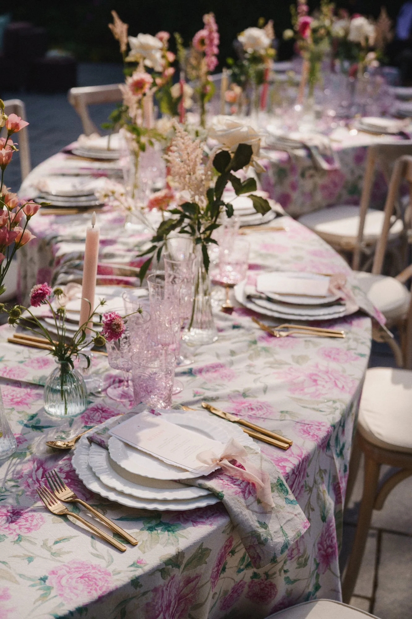
Summer Garden Celebration at Styal Lodge. Image by ARJ Photography.
A particular curve or shape might reappear on a menu. A colour first introduced through an envelope might find its way onto your reception tables. Or an illustration can become a tiny detail on a place card or a larger feature within the wedding-day stationery. None of those elements need to be a perfect match. In fact, I usually think the most beautiful weddings are the ones where they don’t!
Creating a cohesive wedding look isn't about repeating the same design everywhere or making every piece look identical. It’s about establishing a visual language, then allowing it to evolve naturally from the invitations through to the day itself.
Here are some of the things I consider when creating a stationery suite that feels part of a much bigger picture…
Always start with the feeling
Before thinking about individual stationery pieces, I like to understand the atmosphere we're trying to create. Is the wedding romantic and ethereal? Bold and architectural? Relaxed and garden-inspired? Or something much harder to put into words? That feeling becomes far more useful creatively than trying to choose a fixed “theme”.
For example, this elegant suite at Capesthorne Hall took its cues from the romantic setting and delicate blush palette. Curved forms, tactile layers and illustrated swans felt entirely at home against the grandeur of the Hall, creating a softly nostalgic feel without the design needing to reference the venue too literally.
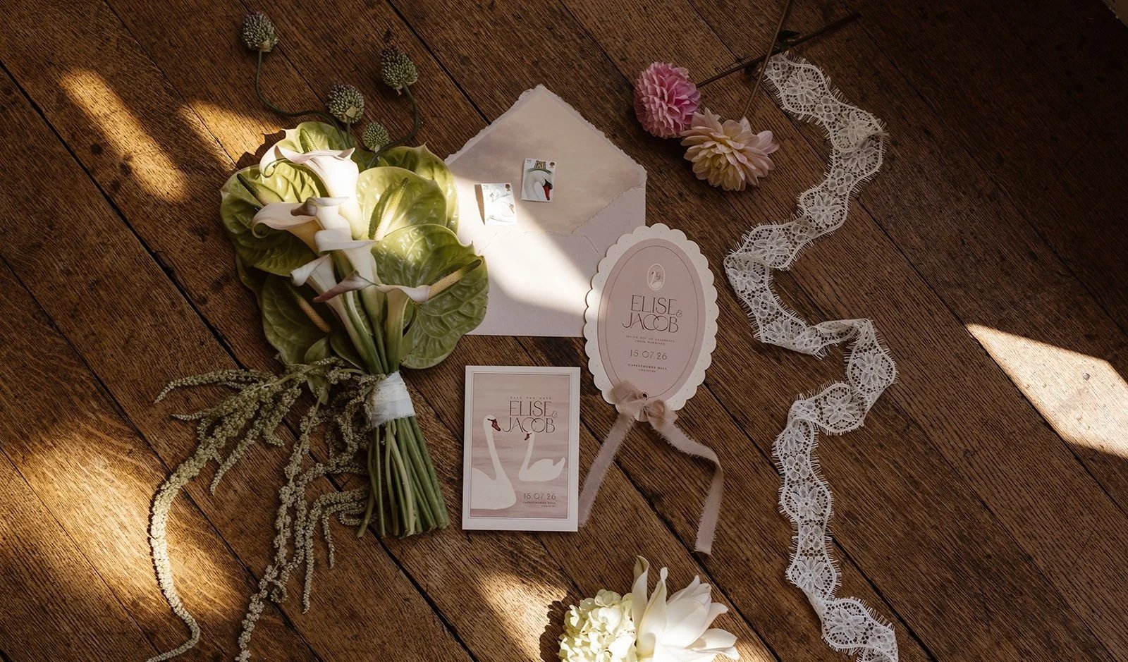
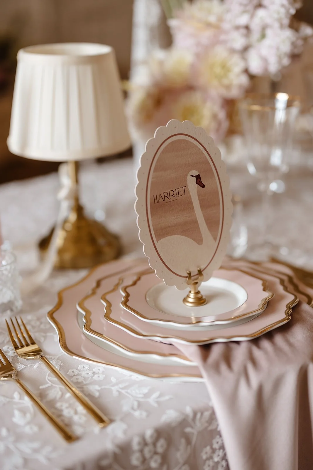
Soft Summer Blush wedding stationery for Capesthorne Hall. Images by LK Jones Photography.
Whereas for this Scottish Highlands editorial, the mood was completely different. Misty blue, deep merlot and beautifully tactile papers created something richer and more dramatic, with tasselled place cards and handmade details adding movement and texture.
Both are cohesive. They just tell very different stories.
And that is the point.
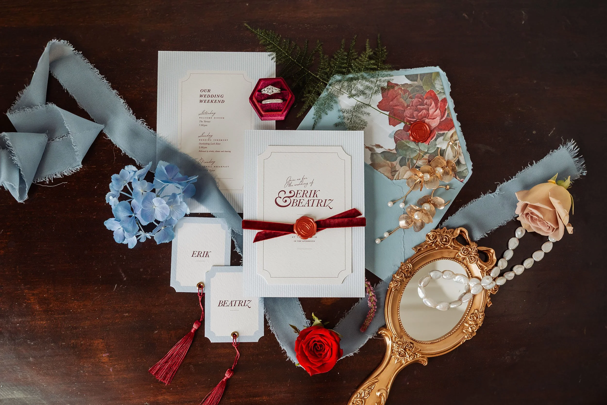
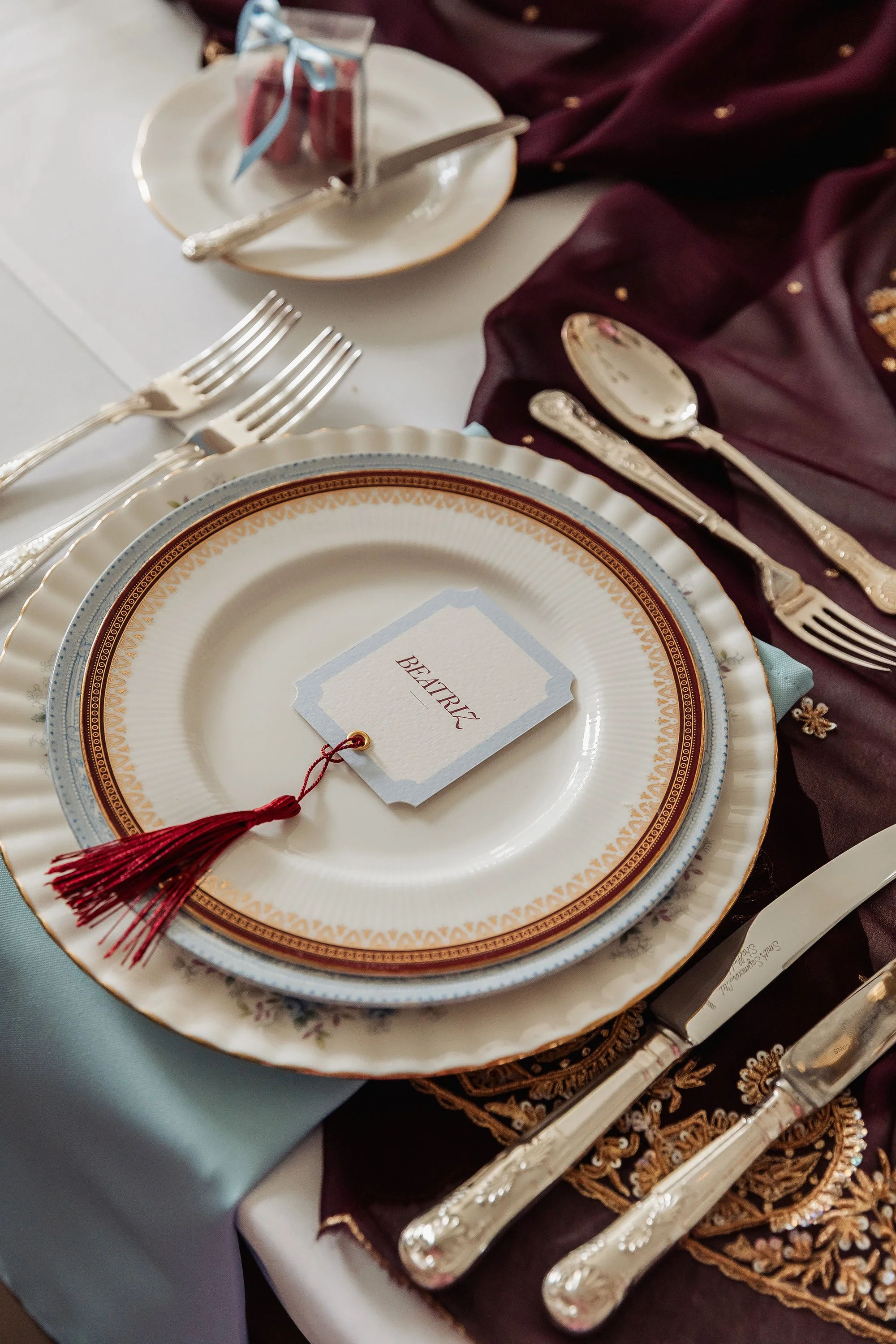
Scottish Highland Editorial. Images by Something Blue Photography.
Create a visual world, rather than a logo
Wedding stationery is increasingly talked about in terms of “branding”. There are certainly similarities: a monogram or a consistent typeface can help tie the visual side of a celebration together. But I prefer to think of it a little more loosely. You're not building a corporate brand. You're creating a world for a celebration.
That might begin with two typefaces that work beautifully together, a distinctive colour combination, a recurring illustration or an unusual shape. Sometimes the most recognisable element is barely an element at all. It could simply be the way colour, space and typography are handled consistently throughout the stationery and wider styling.
For this Arley Hall design, the architecture and gardens provided inspiration without needing to cover every piece in drawings of the venue. And on that particular point… venue illustrations can be lovely, but my personal take is that they are absolutely everywhere. Your wedding is about so much more than the venue itself, and I think there are far more interesting ways to let a setting influence the design.
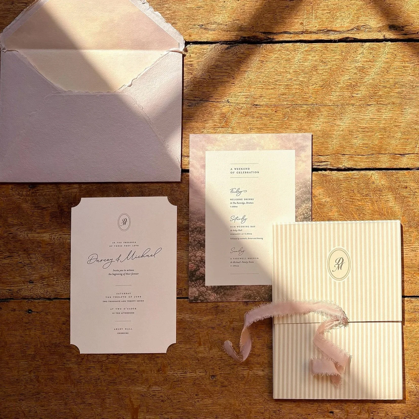
Arley Hall Wedding Invitation Suite
It might be something as small as the shape of a doorway, or a detail from the gardens. Sometimes it’s less literal than that and comes simply from the feeling of the place. That way, the stationery still feels connected to its surroundings without becoming too literal or overly themed.
For me, that's often where the most successful wedding stationery sits… personal enough to belong only to that celebration, but restrained enough to still feel elegant.
Let the invitation introduce the world of the wedding
Your invitation is often the first tangible glimpse your guests have of what is to come. Long before they walk into the venue, see the flowers or sit down at the table, they have held the paper, opened the envelope and experienced the colour, typography and materials you have chosen.
Those choices should never feel random. It’s these decisions that create the feeling you want to establish.
A beautifully understated invitation might suggest an elegant, intimate wedding. A sculptural suite with unusual shapes and vivid colour can hint at something higher energy and more expressive. Even tiny details can do a surprising amount of work. Things like a hand-torn edge can soften otherwise crisp typography, while a ribbon, wax seal or embossed detail can introduce tactility in a way that no digital element ever really can.
The aim isn't to show your guests the whole wedding before they've arrived.
It's to make them want to see more.
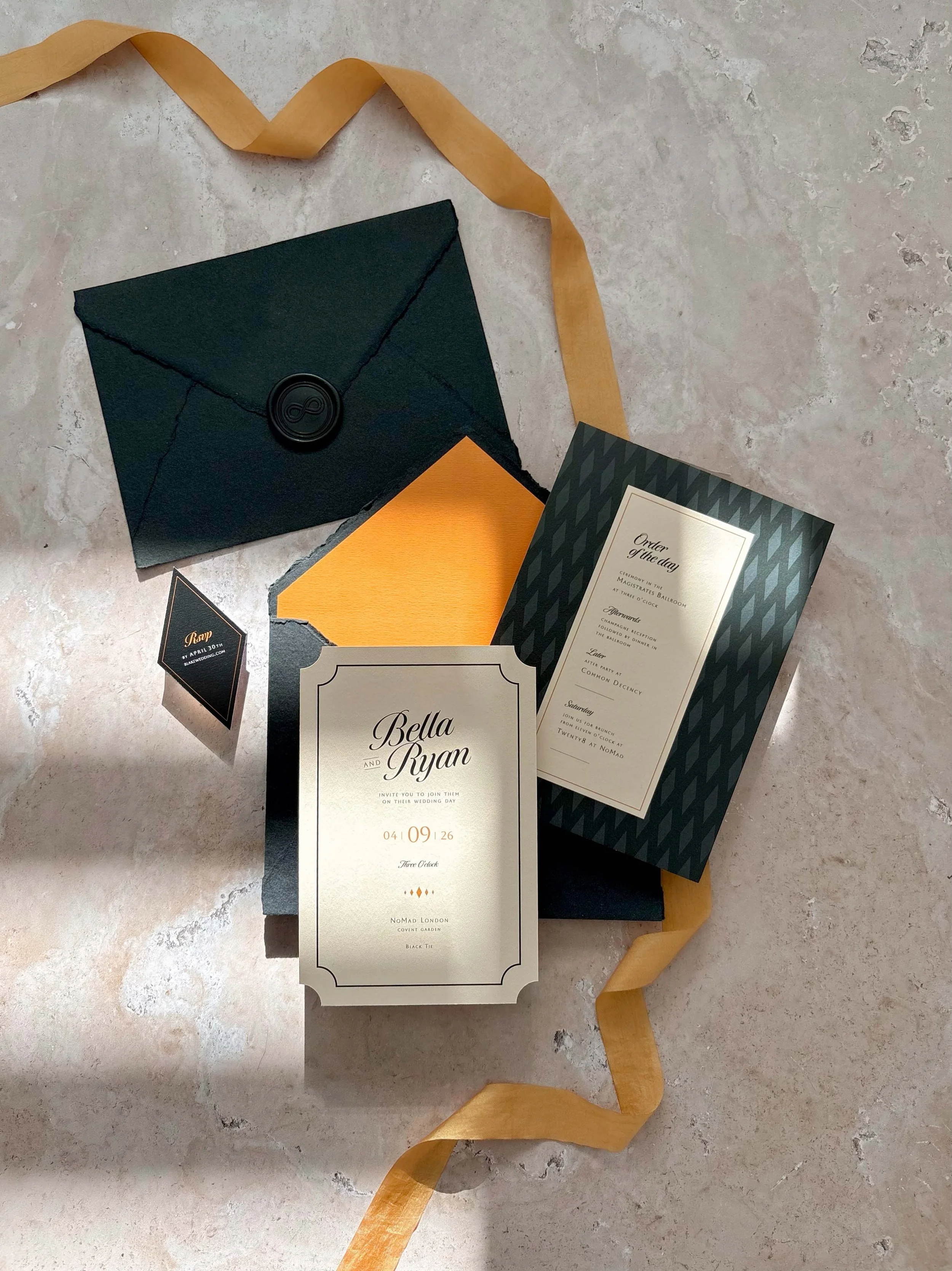
Black-Tie Wedding Invitation for a London City Wedding
Repeat details subtly
This is perhaps one of the biggest differences between a wedding that feels thoughtfully designed and one where every individual piece has simply been chosen because it looked lovely on its own. And yes, cohesion often comes from repetition… but repetition doesn't need to be obvious.
A shape introduced early on might later influence the outline of a menu, and an illustration that feels important on the invitation may only need the smallest nod on the wedding day itself. Even colour can shift in emphasis, with something used sparingly on the invitation becoming much more confident once guests arrive at the venue. I really love those kinds of visual echoes because they create connection without making the whole thing feel overly coordinated or predictable.
A good example of what I mean is this summer garden celebration at Styal Lodge. The stationery had a very relaxed, romantic quality, with a concertina weekend itinerary finished with olive velvet ribbon and the main invitation wrapped in translucent vellum. Some of those softer, tactile details then carried through to the tablescape, but in a slightly more romantic way, with flowing blush chiffon-silk ribbons draped from the place settings. Nothing felt the same from one piece to the next, but everything belonged.
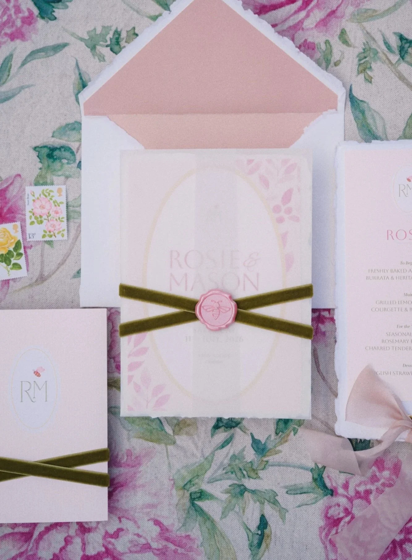
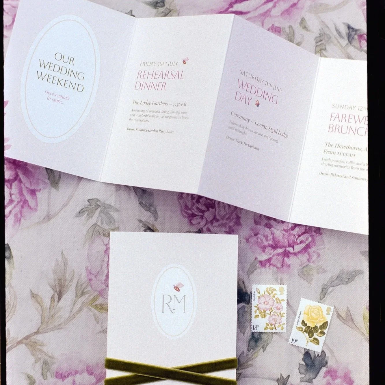
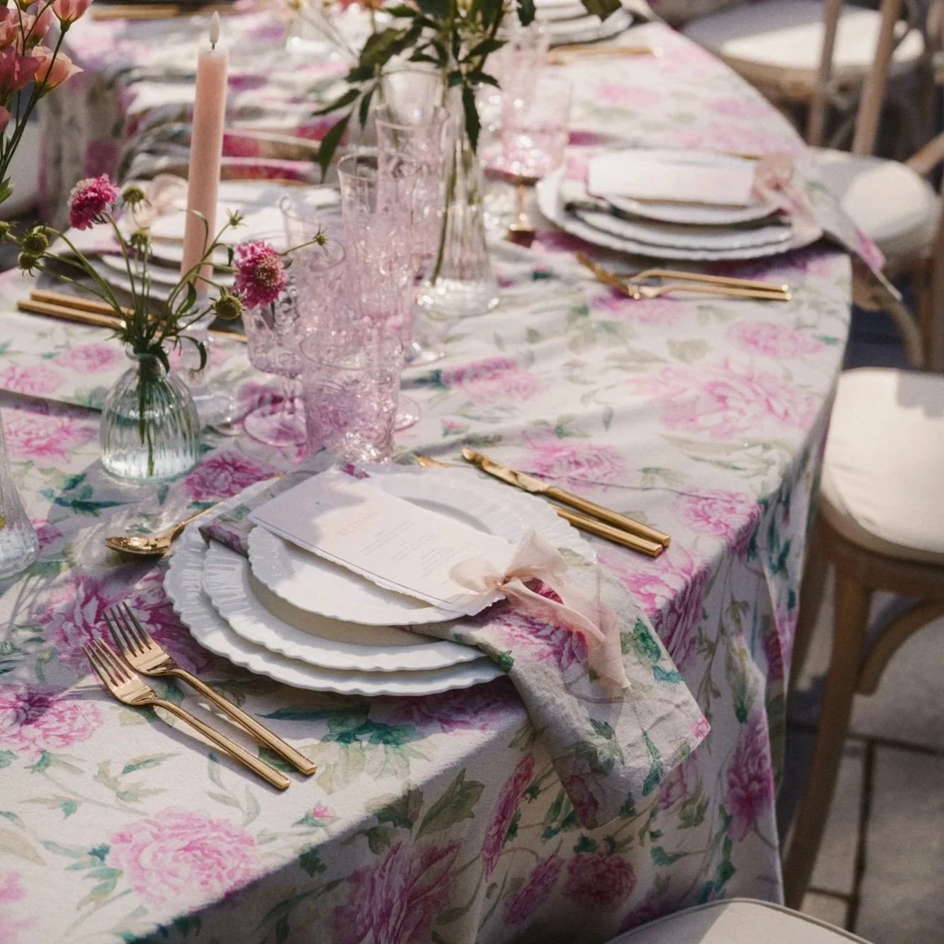
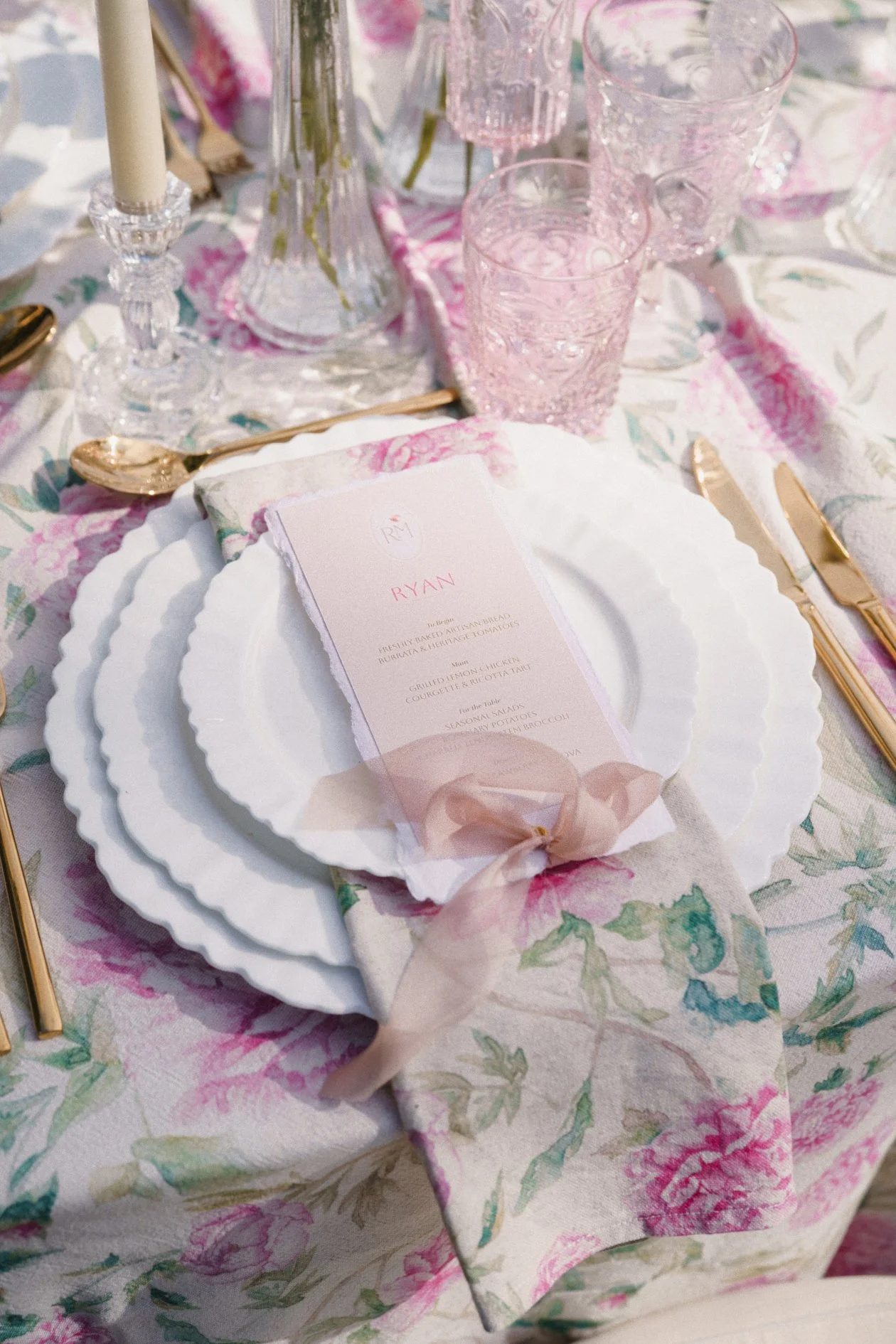
Romantic Summer Garden wedding stationery for Styal Lodge. Images by ARJ Photography.
Think beyond colour
Colour is often where couples begin when thinking about how their stationery will look, and it can be a wonderful way to create consistency. But a cohesive aesthetic can come from so much more, so here are a few other starting points you might consider:
Paper texture can completely alter how a design feels. Smooth, crisp stock creates something very different from a soft cotton or handmade paper.
Shape can become part of the identity too. A scalloped edge or an unusual die-cut can give the whole suite a recognisable silhouette.
Typography is another incredibly powerful tool, and coming from a design background it is something I’m very passionate about. I know how easily poor typography can undermine an otherwise beautiful design, but when it’s handled well, it’s often the unsung hero. A carefully chosen typeface can evoke a feeling that runs from the invitation through to the menus and signage, creating consistency without anyone consciously noticing why everything works so well together.
“Bad typography is everywhere. Good typography is invisible”
This Craig Ward quote has always stuck with me, and pretty much sums up how I feel about typography.
Even proportion matters. How much white space surrounds the wording? Are layouts delicate and airy, or bold and graphic? Are details tiny and considered, or deliberately oversized?
These decisions all create the character of the design.
Allow the stationery to evolve on the wedding day
The invitation suite and the wedding-day stationery should feel related, but I don't think they have to be identical. By the time guests arrive at the wedding, the stationery is no longer being experienced in isolation. It's sitting against linen, flowers and the venue itself, with all the atmosphere of the day around it. And the last thing you want is every element competing for attention.
That gives you an opportunity to let the design evolve. Perhaps the invitation was predominantly ivory with only a touch of burgundy, but the dinner stationery can become richer and more colourful, creating contrast against ivory linens. A ribbon from the invitation might even inspire a softer detail at the place setting, without being repeated literally.
That evolution is what makes the whole thing feel layered and integrated, rather than simply matched.
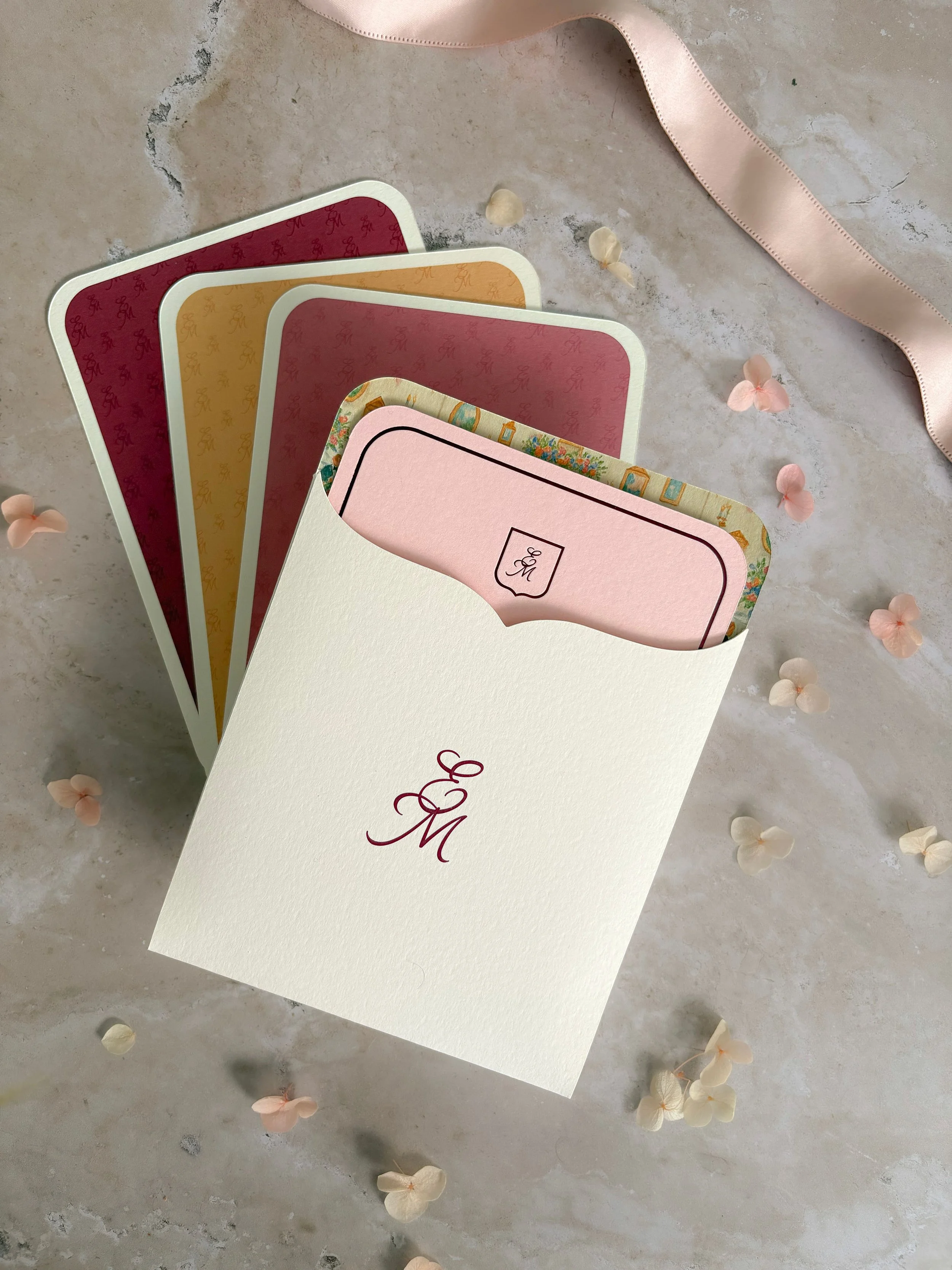
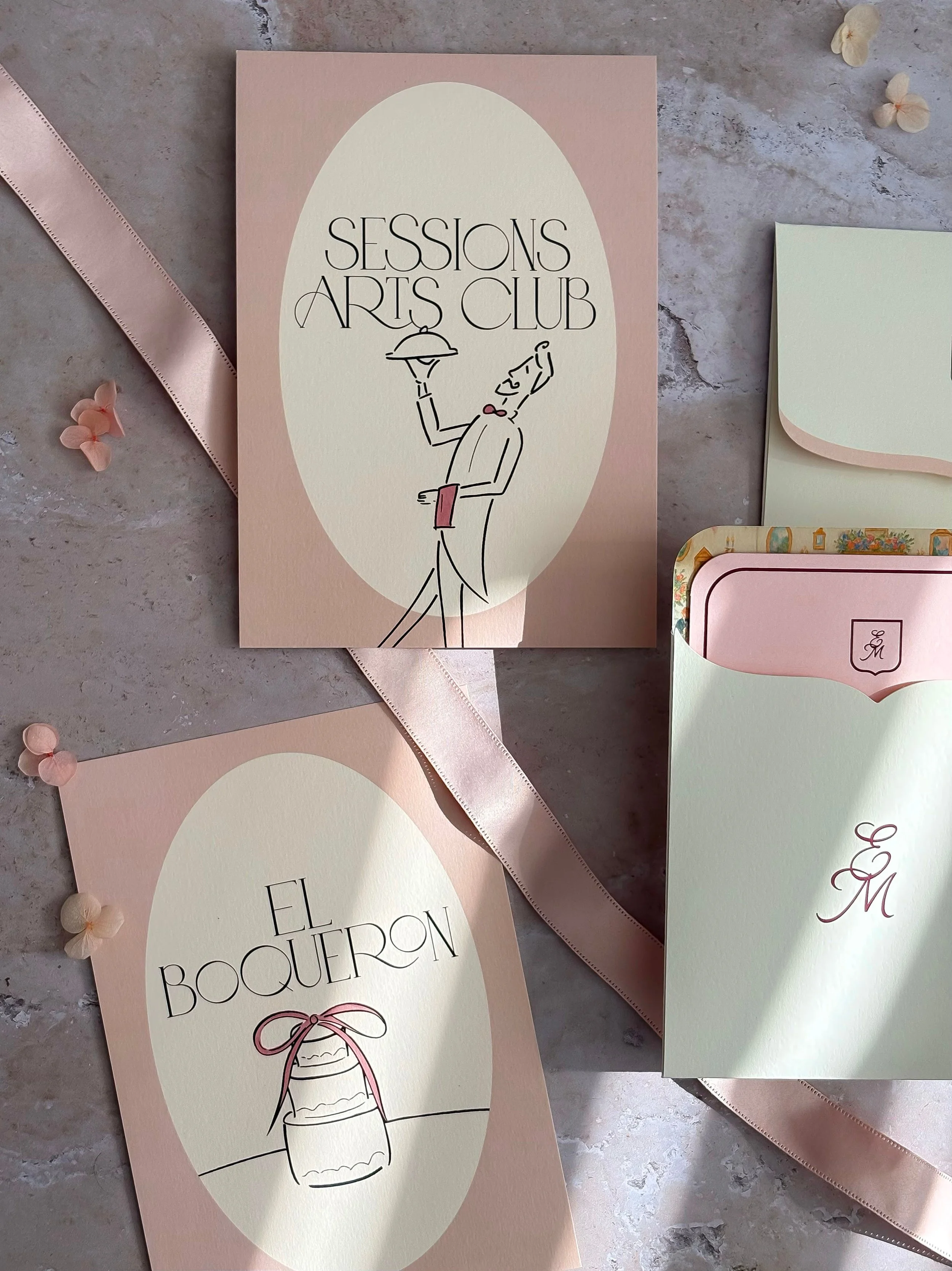
Bespoke stationery for a spring wedding at Cashel Palace
Cohesion doesn’t mean perfection
A beautifully designed wedding doesn't need every element to match. Flowers don’t need to be the exact shade of the invitations, and every sign doesn’t need to look as though it came from the same template. Some details can repeat throughout the day, while others simply need to feel as though they belong in the same world.
The aim is harmony rather than perfect coordination. When the stationery feels connected to the wider setting, there’s room for contrast and personality. Some things should be noticed immediately, while others can sit more quietly within the bigger picture of the celebration.
When it works, you don’t really notice the cohesion at all. You just feel that everything belongs.
If you're planning a wedding and would like your stationery to be considered as part of the wider visual story of the day, you can explore my Signature Collections and bespoke design service, or get in touch to tell me a little about what you're planning.
Carrie x